Type Hierarchies: Magazines
OK! issue: 911, 7th January 2014
Firstly I noticed that when looking at OK! magazine, the ratio of text to images means that there is very little body copy. The magazine is filled with large colourful images much like the double page spread I have chosen here. This also impacts the way the pages are read, the mass amount of images causes the eye to glance at them before reading the large title.
This therefore means that the large title in black and white is read first because it surrounded by white space and is less chaotic.
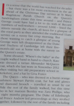
When looking at the type I noticed that it's font is Garamond:
They have perhaps used this to follow along with the story about the Royal Family and used a strong serif font to show tradition. However I noticed that within the double page spread at least three different fonts are used which is rather different from the simplistic websites I have deconstructed previously.
The next piece of information which is viewed next is the photograph at the bottom of the first page, this is because of the direct eye contact with the viewer, therefore the text is briefly read.
The eye then moved to the opposite page where there is also text situated on a photograph, this is read next before following sweeping motion back to the top of the page spread.
The eye is then drawn towards the top of the page where there is text situated under the title, this is in capitals and is in bold as well as regular and italic versions of the font.
The top of the page is then reads the red text at the top; the information seems to be an extra based on the title:
Finally the text that is left is the large amount of body copy, this is typical of these types of magazines (based on celebrity news and gossip) this means that the viewer reads the smaller amounts of texts and photographs before deciding if they will read the body copy.
This is also evident in the amount of text that is available, the images are in a much larger amount and also in their size too. Therefore making the magazine easily read and perhaps for an audience who doesn't want to spend their time reading lengthy articles.
Type Hierarchy:
Yours Magazine
Issue: December 28th- January 6th.
I have found that from looking at this magazine and in particular this double page spread, it suits its target audience and completely contrasts OK! magazine. Yours is generally for middle aged women and this is reflected in the amount of body copy within the article, OK! magazine was mainly images and very little text however Yours is mainly body copy.
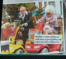
Firstly the eye is drawn to the large photograph in the centre of the page which means that the text with it is also read. The text stands out because it is quite bold and pink (bright).
The eye is then drawn to a similar colour (top left) which states what the style of article is, possibly something they continue throughout their issues.
The eye is then drawn towards underneath the photograph and avoids the body copy, this is because usually we view what the article is about before it is read.
This means that the eye then captures the attention of the brightly coloured photograph to the left which could link to the actual story, therefore we view the photograph before then wanting and beginning to read the body copy.
This means that through beginning to read the body copy it leads to the next page where the next column is read before being redirected towards the pink at the bottom of the page.
Once this has been read the eye is then directed towards the yellow circle, which states a film will be released, this therefore encourages the viewer to then read the rest of the body copy.
This article uses a range of several different fonts including both serif and serif- both OK! and Yours have used a serif font for their body copy. However they have also used a script font for "heart to heart" which could be used due to the idea of femininity rather than its function to be read.
Text Hierarchy:
Now Magazine
Issue: 6th January 2014
(Another Gossip/Celeb Magazine)
The title at the top of the double page spread is read first due to the contrast in black/white and also the bright purple that is used, this is also read first due to its point size being bigger than any other text on the page.
Once the title has been read, the eye focuses on the text grabber which is the quote in the centre of the page before following the page to the images at the bottom.
The eye is then drawn to the bottom of the page where two images state "then" and "now". The text is in yellow and black which contrasts and therefore makes the viewer read them, these images also link towards the rest of the article.
I found that once these were read, my eye followed the page to the top towards extra information on what the interview is before the eye is drawn to read the article.
The viewer then begins to read the body copy text beginning with the large "w" which is in a bold font.
Before reading the rest of the body copy the eye is drawn to the images because these may suggest what the content of the article. This is designed and considered because they want to reader to complete the full double page spread and remain interested.
The viewer then reads the rest of the article.
Text Hierarchy:
I found that through looking at magazine layouts they differ and contrast incredibly much depending on their purpose and target audiences. This also was reflected in the amount of text: less text usually means the article is more informal. Gossip magazines often use lots of colour and a wide variety of different fonts to keep the attention of the viewer instead of being simplistic and minimal.


No comments:
Post a Comment