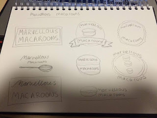
From looking at existing branding for bakeries and patisseries I gained a knowledge how Marvellous Macaroons could fit into the high street. I made a few sketches which could follow various styles, to figure out which would aesthetically incorporate their brand values I began to vectorise a few ideas:
I started with looking at the basic idea of a circle being representative of the macaroon shape and the use of pastel colours which is quite popular within bakery branding as it is softer and more natural looking.
In this design I developed it from the previous and looked at how the introduction of a banner could lift the design beyond being flat however these two logos seem to look stereotypical of what I was previously looking at in my research. Macaroons needs to stand out on the high street and by following usual design elements this would mean it could blend in but wouldn't follow their brand ethos.
This meant that moving forward I looked at my first initial sketch which was simply just typographical and suggested use of a sans serif font. I tried various formats and a square would be the best fit for putting it across various elements as its versatile.
I moved this forward to then look at how it could be used on a menu design to think about how the brand could be used. However I found that the logo itself doesn't really resemble macaroons and the plain colours don't incorporate the colourful creative brand values.
To represent marvellous macaroons' brand ethos I went back to thinking about how macaroons could be represented and instead of creating a detailed sketch like previously I simplified it down into vector shapes. From my previous experimentation with colour I found that using pink, green, blue and yellow showed various vibrant colours that worked together and weren't overly feminine.
From creating these macaroon vectors looking at the curved element of these I looked at fonts which also have this rounded and circular look.
I experimented with various layouts above including the vectors, rounded type and colour however the rectangular shapes seem quite rigid and don't represent the macaroon as a product.
After experimenting I finally managed to find a way of incorporating all the elements I experimented with into one logo. The contrast of black and white allows for the typography to stand out and the use of colourful macaroons brings the idea of creativity and colour to life. To move the branding forward I need to look at how this logo could work across various materials that are relevant for a patisserie.


No comments:
Post a Comment