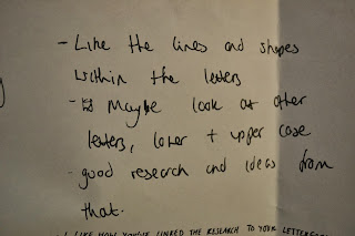
For the interim crit (brief 3) we took a more informal viewpoint on giving feedback for peoples work. Work was laid out on the tables and people were allowed to interpret the work as they saw it rather than having it explained to them. This proved to be incredibly useful because it proved as to whether the letterforms communicated your intentions or something entirely different. Here below are the comments which were hand written and left with my work.
I found that I did receive a lot of positive feedback about my research through looking at books of primary images rather than just looking at typography. From the critique I found that the most important points to take away and develop my designs include experimenting with thick and thin lines (line weight) as well as experimentation with descenders. Other comments also mentioned about experimenting with three dimensions and shadows which I could look into incorporating into my work. However I did also see that I receive negative feedback which concluded that my typeface wasn't "personal enough" which could be due to a number of reasons, since it is one of my first crits I have now recognised that my concepts need to be made clear in written form on design boards (not just on my blog) when presenting. But also because of some of the feedback mentioned about the other ideas I had started with (geometric shapes and angles) I have decided not to follow these ideas forward because I found that Joe's work contains a lot of these elements and I wanted to expresses a different side to his personality and likes. To continue my development within this project I will begin to experiment with line weight and how lines can cross over each other in terms of architecture, as well as creating stems of letters to be thick or thin in terms of the "structure" of the letter also representing the structure of a building.


No comments:
Post a Comment