From looking at my research based on Joe Auckland I picked out the most important elements of his personality/ likes which I felt would represent him best within a typeface.
My words of choice to use to represent Joe would be that he likes; maths, geometric shapes, angles, swedish architecture, minimalistic design, clean cut lines and grids.
From my visual research I began manipulating the font code with the idea of changing the crossbar on the A as well as adding geometric shapes such as triangles within the letterform. I also made the A into a triangle and added the 90 degrees symbol however I don't feel this would work because I saw that in Joe's work he has done a lot of typography work on angles (summer brief) and also geometric shapes into typefaces. On reflecting this initial ideas I found that I wanted to look at his love for clean cut lines (his hate for mess) and also love for Swedish architecture.
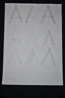
The small designs above are some initial ideas for manipulating the font with adding lines and also adjusting the line weight/ crossing lines over. I found that out of all of these I liked two (top row; second and third) this is due to the fact that they are subtle changes to the font and also still represent the letterform.
From looking at my most successful in the previous images I experimented with the idea of adding straight lines into the letterforms, however I found that I didn't think these were as successful because they don't represent the letterform as clearly.
I also revisited the idea of geometric shapes and added smaller triangles (from first designs) into parts of the letterforms. The thin outline and cuts into the letterforms I felt fitted my intentions and worked well as it does represent the geometric patterns that Joe likes. I then simplified this design to just simple lines rather than including patterns, this further enhances intensions for a minimalistic design.
After a critique of this work (with a couple of class members) before the interim crit, they mentioned I should try the designs onto Adobe Illustrator and adjust line weight but also considering the angle of the lines used. These were my first three designs before the class critique:
I felt that the middle letterform worked best because of the thin line weight however I think I will take this further and develop the line work perhaps through editing the strokes or changing the layout so the lines overlap.


No comments:
Post a Comment