A4 Poster:
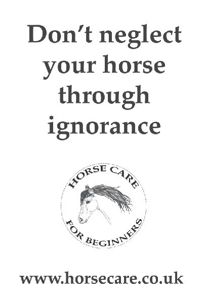
I started off with thinking about making the poster particularly text heavy because I think the statement stands out and would make people look at the information. The research I had previously looked at included a mixture of type and image however I feel for my brief that type should be dominant on the page and therefore larger, so I played around with scale using the typeface palatino I previously used on my website.
However white is too plain, although would be less expensive it doesn't fit the aesthetic I used on my website. Sans serif fonts I feel would appear too modern and clean cut for the previous aesthetic from the website but also the fact that this brief is about horses and the countryside. Using letterpress with the print project's workshop influenced me into wanting to use type that was perhaps a little more rough and less perfectly formed.
Images from the workshop:
Although I would have loved to of letter pressed my whole campaign, I did not have the time nor the facilities to do so therefore I had a look at some online alternatives although they do not provide the same affect by any means.
I tried a few out but the one above didn't work at all because whether close up or from a distance it was incredibly illegible.
Although I really liked the look of this font, it needed some work in the spacing as I printed a quick test print and found that the gaps where the R's are were too wide in the original font.
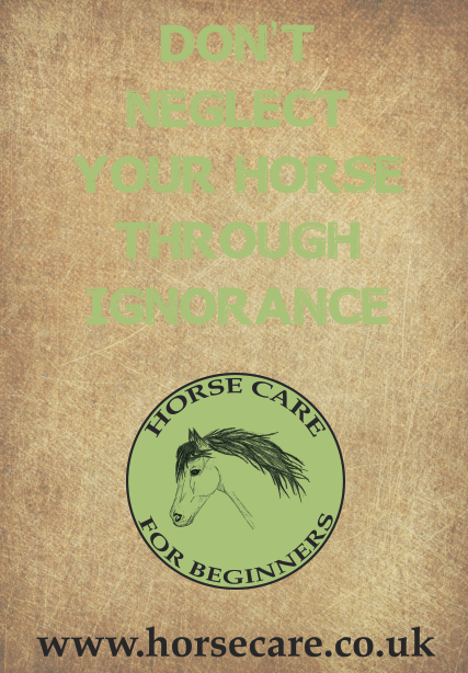
I wanted to include some of the colours from my website into the scheme as I have chosen to go with a scratched looking background which is earthy colours. The only one that seemed to contrast it at all was the green although it was a little too dark when I used it in CMYK from the RGB images of the website. I lightened the colour and they now seem to work quite well together although I think the logo needs a black ring around it to match the bold type. I put the website in a simple font (palatino) so this could be read however I think this could be made much smaller as I printed a quick copy to check the scale.
I wanted to include some of my illustrations in some way or form however they didn't seem to work at the top and appeared over crowded, the background also seemed a little too dark as well.
So I lightened the background and played around with the size of the type, although after seeking feedback they suggested that the bigger type works much better but perhaps I could make the logo and link smaller.
The layout works far better although the images still seem to seep into the background rather than being a feature. The darker shadows of the background work far better with the lighter green so I will experiment with ways of incorporating lighter colours into the type as I used some elements of white and cream type on my website. (link bar)
The green as an outline makes the poster appear a little too modern as it seems to have an odd "neon glow" feel about it.
So therefore I tried to use the green on it's own but it didn't stand out from the background at all.
By using a black outline it helped the type actually become legible but doesn't stand out as much as black typography.
I really liked the white typography as is seems to stand out from all the other darker elements and this is the message which needs to stand out first before the lower part of the poster.
Commercial print: 300dpi, cmyk, bleed
When researching for the "augmented" element I decided to place a scan code for the website so therefore added it to the bottom where viewers can have the option of scanning or typing in the website.
A5 flyer: The flyer will provide the website information in a smaller format that people can take away with them. It should include the same quote and information as the poster but in a more interesting format that people will want to pick up. From research I really liked the WWF poster:
There are many different examples of this usage, although I think I need to find a way of incorporating the quote "Don't neglect your horse through ignorance" as part of the imagery.
http://fc00.deviantart.net/fs50/i/2009/272/9/c/Typographic_Portrait_by_staceygrove.jpg
It works quite well when certain words are made larger than others to allow them to stand out through their typographic hierarchy, or perhaps they could be changed to different colours.
I first of all tried to create the text into a block which includes keywords from my website and the quote in a different colour, however this was incredibly difficult to read so I tried it in a few different colour ways:
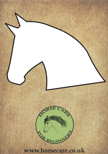
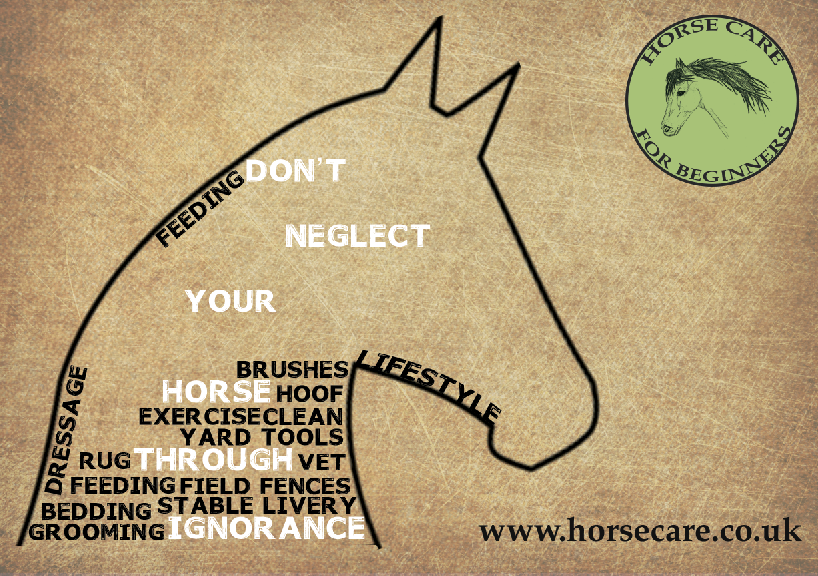
However even though they seem to work a little better it seems quite top heavy and stagnant. So therefore I thought about using some different shapes for the flyer. I initially thought about putting the type into a horse shoe shape, but this is quite clique and over done. My logo includes an illustrated horses head so perhaps using this shape to create a similar outline would work quite well, I removed the mane to allow for a more simplistic shape as it is a small flyer.
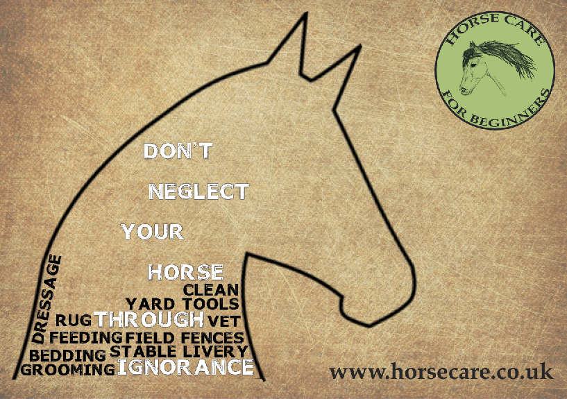
However the shape itself doesn't seem to work at all when in portrait format so therefore I changed it to landscape and it appears more balanced as I placed the logo and imagery much like a postcard layout.
http://www.kings.cam.ac.uk/files/archives/201103-post-card-big.jpg
I initially used outlines on the white text to be able to place text around it, however I found that the more text I added in black, the outlines weren't necessary.
It took quite a few attempts for me to understand how to tweak the text using photoshop and warping its position.
However I found through making the text smaller it was easier to warp into position especially around the muzzle and neck. I had also warped the text within the ear wrong so decided to fill it with large amounts of smaller type which took quite a while. The whole process of adding each individual word and ensuring it fits correctly took a large amount of time but I think it works quite well.
I also noticed that the link at the bottom wasn't correctly aligned to the head of the horse:
To ensure that the flyer continued the augmented element I again added the qr code and scan code to allow viewers to use their phones to access the website or do it themselves if they only own a pc and not a phone with internet capabilities.
Commercial print: 300dpi, cmyk colour mode, bleed
Business Card: This will be given out at events as a way of giving out the fundamental parts of information people will require in a small format. The imagery which works on the A5 flyer will not transfer as business cards are far too small but they are a good way of raising awareness of the websites presence.
Preparing for commercial print: (300dpi, cmyk, bleed)









No comments:
Post a Comment