Wednesday 30 October 2013

OUGD403- Monoprint Induction

 In today's session we were introduced to the method "monoprinting":
Monoprinting is a form of printmaking that has images or lines that can only be made once, unlike most printmaking, where there are multiple originals. 
Some of the examples below were a collection created for teaching purposes and showed how using different stencils, layering ink and the amount of ink can affect the aesthetics of the print and create different textures based on the papers used. 


After being introduced to mono printing I experimented with the font "dense" and cut stencils of several letters to print with black and red inks. I experimented with layering stencils to create a drop shadow as well as layering colours with already used stencils. 


OUGD403- Brief 3: Design Development

After Interim Crit:


Within my interim critique it was expressed that I should experiment with thick and thin lines to create contrasts within the letterforms based on the idea of structure and design. However I felt that the original shape of Avenir Next Ultra Light as a typeface was too thin and feminine so I widened the letterform as a whole and also added an apex to the top of the A, when experimenting with letterforms I also looked at the idea of adding a solid black element to the bottom of the letterform to represent structure and morals, due to Joe's work ethic. Within the designs below I began to further develop my ideas of using a multitude of lines and line work based on my visual research on the architecture style Joe likes, as well as geometric shapes and his love for maths. 
I like the overall shape and structure of this letterform because it is more masculine, even though Joe tends to like thin letterforms I feel that a bolder letterform would suit his personality more (outgoing and social) than the connotations with a thin typeface. 

I tried firstly by creating lines seen on the swiss architecture that I have looked at within books and in my initial research to make the letterform appear to be much like a building in terms of structure, therefore the letterform contains both Joe's outgoing personality and love for maths and structure.
However I found that by simplifying my design it works best as a font and contains elements of all the development work I had experimented with. The letterform also represents the feedback I had received about it representing a building and the formal ideas of structure and to represent a person who is technically minded (his love for shapes, maths, money, mechanics for example). 

Tuesday 29 October 2013

OUGD403- Brief 3: Interim Crit

For the interim crit (brief 3) we took a more informal viewpoint on giving feedback for peoples work. Work was laid out on the tables and people were allowed to interpret the work as they saw it rather than having it explained to them. This proved to be incredibly useful because it proved as to whether the letterforms communicated your intentions or something entirely different. Here below are the comments which were hand written and left with my work.


I found that I did receive a lot of positive feedback about my research through looking at books of primary images rather than just looking at typography. From the critique I found that the most important points to take away and develop my designs include experimenting with thick and thin lines (line weight) as well as experimentation with descenders. Other comments also mentioned about experimenting with three dimensions and shadows which I could look into incorporating into my work. However I did also see that I receive negative feedback which concluded that my typeface wasn't "personal enough" which could be due to a number of reasons, since it is one of my first crits I have now recognised that my concepts need to be made clear in written form on design boards (not just on my blog) when presenting. But also because of some of the feedback mentioned about the other ideas I had started with (geometric shapes and angles) I have decided not to follow these ideas forward because I found that Joe's work contains a lot of these elements and I wanted to expresses a different side to his personality and likes. To continue my development within this project I will begin to experiment with line weight and how lines can cross over each other in terms of architecture, as well as creating stems of letters to be thick or thin in terms of the "structure" of the letter also representing the structure of a building.

OUGD403- Brief 3: Typeface

From looking at my research based on Joe Auckland I picked out the most important elements of his personality/ likes which I felt would represent him best within a typeface.
My words of choice to use to represent Joe would be that he likes; maths, geometric shapes, angles, swedish architecture, minimalistic design, clean cut lines and grids. 


From my visual research I began manipulating the font code with the idea of changing the crossbar on the A as well as adding geometric shapes such as triangles within the letterform. I also made the A into a triangle and added the 90 degrees symbol however I don't feel this would work because I saw that in Joe's work he has done a lot of typography work on angles (summer brief) and also geometric shapes into typefaces. On reflecting this initial ideas I found that I wanted to look at his love for clean cut lines (his hate for mess) and also love for Swedish architecture. 


The small designs above are some initial ideas for manipulating the font with adding lines and also adjusting the line weight/ crossing lines over. I found that out of all of these I liked two (top row; second and third) this is due to the fact that they are subtle changes to the font and also still represent the letterform.


From looking at my most successful in the previous images I experimented with the idea of adding straight lines into the letterforms, however I found that I didn't think these were as successful because they don't represent the letterform as clearly.


I also revisited the idea of geometric shapes and added smaller triangles (from first designs) into parts of the letterforms. The thin outline and cuts into the letterforms I felt fitted my intentions and worked well as it does represent the geometric patterns that Joe likes. I then simplified this design to just simple lines rather than including patterns, this further enhances intensions for a minimalistic design.


After a critique of this work (with a couple of class members) before the interim crit, they mentioned I should try the designs onto Adobe Illustrator and adjust line weight but also considering the angle of the lines used. These were my first three designs before the class critique:


I felt that the middle letterform worked best because of the thin line weight however I think I will take this further and develop the line work perhaps through editing the strokes or changing the layout so the lines overlap. 

Monday 28 October 2013

OUGD404- Type Journal

Production Methods

Hand Rendered Type


"In Hand Job, graphic designer and hand typographer Michael Perry curates a selection of work from fifty outstanding designers, illustrators, and typographers, who integrate hand-drawn type into their designs. Each entry is shaped entirely by the artist’s hand and unique process, including the unplanned “accidents"of line, color, and craft. In addition to exhibiting a spectrum of styles and approaches, Hand Job also includes photographs of found type and artists’ studios to give readers a stronger understanding of what goes into creating hand-drawn type."
http://www.mikeperrystudio.com/detailed/175

 From starting my type journal I began by looking at books I had seen previously on my college course, I remember this book incredibly clearly as my teacher had introduced this to me. Hand rendered type is often informal and tend be less clean cut and contain an aura of creativity and individuality as not all the letterforms are identical- its imperfections are often cherished. 

Sophie Henson

http://www.synergyart.co.uk/uploaded_images/wordysketchbook-719992.jpg

I already admire Sophie Henson's work in terms of typography- her work is incredibly informal and often shown in sketchbooks along with small illustrations which tell a story.


http://www.behance.net/gallery/Hand-Rendered-Type/10652883

Whilst looking on the blogging website "Behance" I came across this font created by a particular user. In which I find the individuality of each letterform fascinating in itself even though they also all work as a set. This also does relate to my brief 3 (OUGD403) because we had to create a hand rendered font on tracing paper- much like this designer has also done. 

http://www.behance.net/gallery/Hand-Rendered-Typography/5219393

This piece particularly caught my attention because of the use of line/ line weights within the words. Mark making has also been used within these letters to create textures, and this form of typography cannot usually be created on the computer because it is more personal and highly detailed. 

Sunday 27 October 2013

OUGD404- An Introduction To Type

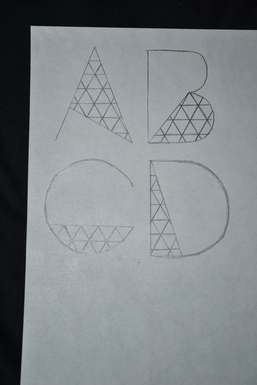
This quote can also be applied to type, due to the origins of letters these three lines now communicate "A" as a letter. This also means that combinations of letters can also translate to words and sounds which have all been agreed to mean something. Otherwise the letter "A" would simply just be three lines.


Many forms of letters can also be understood to also mean the same thing this is because of the idea that meanings are repeated until A in its most simplistic form is understood, therefore any variations of it are also understood to mean the same thing.


Typography as a whole has its own origins which are based around the world and not just from the western world. 

Each of these forms of material created the basis of how type was created and all the typefaces which are used and seen now have all been created from a variation of one or more of these origins.

Stone 


The Romans used stone to express ideas and record information, the letterforms were carved using serifs and a variation of thick and thin lines due to how stone carved. The letterforms were created from chisel strokes to form the indents are one of the first forms of type which has evidence left.

Sable

These types of fonts would have been created using a brush and are the basis for script fonts due to their handwritten origin. The strokes are often unfinished and the thickness of the stroke is often the same due to using a larger brush which doesn't have the ability to vary line weight.

Bone

These fonts would have been created by using bone/ quills which are dipped in ink, this form of material allows for a varied with in line thickness and is distinctive because of this. These fonts often look like handwriting because the line thickness changes where a hand would naturally allow for pressure onto the material. 

Wood

Wooden fonts are created by using blocks which are often large and bold because fragile details such as delicate serifs or thin line weight on the letter would snap within the wood block. 

Lead

Typography created using lead is a developed  version of the original wood block prints however by using a different material. Lead allows for intricate details for prints which therefore can create both serif and sans serif fonts. These fonts created are usually clear and print incredibly crisp onto the page unlike wood block prints which can often be textured based on the type of wood and also the ink used. 

Silicone
This particular font type is created due to modern technology and the idea of vectors. Vectors allow for curves to be made on the computer which could not be made any other way in a traditional format due to the limits of natural structures and straight lines. These are digitally made and can often portray a more friendly and "younger" font due to them being created currently, however these fonts can also contain elements of the other origins (stone, sable, bone, wood, lead).

After looking at these types of fonts, as a group we had to bring in a variety of different typefaces, through looking at our own we organised the fonts into the different categories of origin, however we did initially find this difficult as some of the modern fonts do contain characteristics from multiple origins. 

(from left to right; stone, sable, bone, wood, lead and silicone)


Chose a font which represents each origin clearly:


Stone:


This font in particular I found after researching serif fonts on websites such as "dafont", Day Roman (font of choice) contains traditional elements of the stone origin. This includes the serifs which are small and angular, the font also includes minimal curves on the descenders which is a characteristic of stone inspired modern fonts. 

Sable:


"Painted" (font shown above) contains characteristics of the traditional brush created fonts (sable). The font contains ends of the letters which seem unfinished and informal, these elements all contribute to the idea of this font looking like hand writing and containing mainly the same line weight due to the idea of a brush stroke on paper. 

Bone:


There are many different versions of fonts with the origin of bone, however through looking at my grandmothers traditional calligraphy I found that this font best represents the idea of a quill. This font contains characteristics such as being slightly slanted (italic) which represents handwriting as well as thick and thin line weight which also is extracted from the idea of handwriting and how the ink would of traditionally been pressed onto the page. 

Wood:


Cool Vetica is a bold font which contains the same line weight, it is also contains no apex's (points at the tops of letters such as A, M, N for example). I found that this font would be the most suitable in representing wood as a typographic origin due to the shape of the letters, they would be made easily out of wood blocks rather than containing serifs and delicate lines within the letterform. 

Lead:


Ayres is a font I found on dafont which was listed under the heading "serif", even though this font is also bold like the font I have chosen for wood, this font contains variation in line weight as well as serifs. These would of traditionally been formed with lead, this font also represents the origin of lead because it is clear and doesn't contain gradients or textures which could be considered with other origins. 

Silicone:


This font was found also on dafont and represents silicone origin because it could not of been created in any other form. This font has clearly used vectors created in Adobe Illustrator for example. This font could not of been created using any other origins because of the pixel affects within the letterform.