Thursday 27 March 2014

OUGD404: Type Journal


This type was created by Beth Taylor who is currently in the first year of the design course, she created it for her Bruce Willis movie poster brief which was screen printed. 

http://b-taylor1316-dp.blogspot.co.uk/2014/03/ougd406-studio-brief-03-type-screen.html

I really love this hand rendered type as the serifs are quite strong and masculine yet the sweeping curves on the descender of the Y for example contrast beautifully. Even though this was printed with gold I think it could equally work with black onto white with grey shadows in the lettering. 


OUGD404: Type Journal


Whilst browsing through twitter I came across this post on creative review. I really loved the   large negative space/ counters within the type and can see how this could benefit children with their reading and writing skills. The use of a sans serif font which is quite large enables children to learn to read more easily as the shapes and large counters can be recognised easily. This typeface is created using silicone/digital because it is created of a high number of small dots rather than solid lines and this could not of been created through any other format/method.

Wednesday 26 March 2014

OUGD404: Type Journal


A Beautiful piece of hand rendered type which includes a whole range of different categories of fonts but what brings them all together is the fact that they've been hand crafted by the illustrator. These also look as though they have been digitised once scanned in to allow for a clean and crisp print. 

OUGD404: Type Journal


I initially found this piece online (twitter) through TONE. But was originally from Neon Creations Ltd, with is was written: "And who says actions speak louder than words? The perfect sign just for lunch time".

This piece of course made from neon but initially this design would have been created through the use of digital type/ silicone to then form an original piece which could be created using neon light. As neon light is quite difficult to work with the letterforms have to follow a somewhat continuous line and this therefore means that any other origin of type could not have been used as the word is treated as a whole rather than individual letterforms.

OUGD404: Type Journal


Whilst in hospital it was a good opportunity to see how fonts were used for their function rather than their form, on the whole labels for small amounts of text (as seen above) are written in a sans serif font. The simplicity of the font definitely affects why it has been chosen as the minimalistic letterforms are incredibly legible and therefore readable too. The most important information (product) is put in a larger point size and used as bold to make this information clear. I also found that throughout hospitals it's really helpful to have fonts which are simple and effective in terms of their readability and legibility. The use of fonts and their function is definitely something which as graphic designers we must consider, as in this same instance if a script font was used- it would not serve its purpose even though it would look aesthetically beautiful. 

Monday 17 March 2014

OUGD404: Type Journal

Anthony Burrill


http://www.anthonyburrill.com/projects/work-hard-and-be-nice-to-people

This piece is created using a traditional wood block technique as the fonts are quite simplistic and wide in their form, this therefore allows the letterforms to be created out of wood. This is also the reason why the letterforms are sans serif as serifs are complex to create out of a wood block form. The font used also suits its purpose as a statement poster as the font is also at a large point size and incredibly bold. 

OUGD404: Type Journal


http://www.behance.net/gallery/Nandos-international-campaign-book/14657285


From previously looking at stencil's created by TONE I came across this type whilst browsing on behance and felt as though it was stunning. Within the project he's used a whole range of different fonts however this one in particular is a simplistic script font which as a cover is readable and legible. 

OUGD404: Type Journal


This piece of typography/logo on a fine point marker is created from the origin of sable. The continuous thick brush stroke enhances the overall free flowing nature of the pen and also the handwritten style it follows. The logo as a whole reflects the branding of the marker pen through the use of a sable origin because it looks as if the sharpie has been used to write the logo. 

Sunday 16 March 2014

OUGD404: Brief 2- Layouts

Thumbnails:


Thumbnails really helped me when I was looking at working with the content especially I found more so than working on a larger scale. This is because thumbnails allowed me to look at several ideas rather quickly and I found that although working at a larger scale is useful it does take much longer. However through drawing to full scale I found a range of questions I wanted to resolve:


Setting up the document:


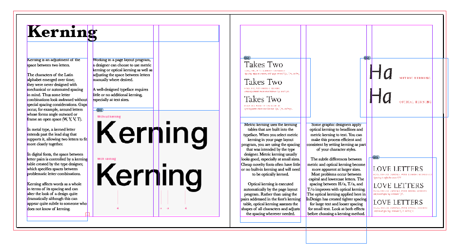
Once explained to me and through drawing I finally understood terminology that would help me to decide on how to edit my document which includes margins. I found through looking at the amount of content that I wanted a fairly small margin- therefore allowing for more space on the page. 


I also figured out how to add columns and the width between these, however I will experiment with the amount of columns. 

I found that I quite liked the use of three columns, I tried the use of Gills Sans as I thought this was quite easy to read, however I found that in body copy it wasn't as easy so therefore I decided upon Baskerville. 


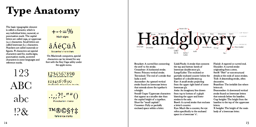
I tried using different layouts which included having the header on its side and also larger but I found that the best combination seemed to be to have quite a large header, bold sub heading and smaller point size for text, the sizes which seemed to work best are: Header Baskerville Bold 48, Subheadings- Baskerville semibold 18 and body copy Baskerville regular 11. The page number is point size 14.


I also considered whether the header should be in the middle or aligned to the side, I found that aligning to the left looked aesthetically better. 


In my questions/concerns I also thought about the use of colour so therefore I tried using grey/black along the header:


However the page looks quite heavy upon the top in conjunction with the large amount of body copy, therefore I will keep my pages simplistic. 


On some the paragraphs of text I have chosen centred alignment rather than to the left, this is because it works aesthetically better in terms of balancing imagery.


Final Pages: