Monday 29 December 2014

OUGD503: "Water is life"


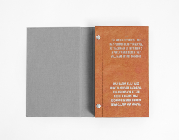
The one which I want to develop is the idea that dirty water does cause death and diseases because a lot of campaigns focus on how fantastic clean water is. However due to the facts I've seen it is still an incredibly horrific that a large amount of the world don't have clean water. 

The quote which gripped me the most was the one based on children:


They are definitely the most vulnerable as when they have their mothers milk they have the immunity against diseases. 

Colours & colour combinations/ schemes:
I want to work with a limited colour palette to allow for the message to be minimal and understood.

Water often seems to be represented as being blue, although in fact colourless it is the light which is reflected which makes us assume water is blue. Blue as a colour is often seen as pure, clean and hygienic which I suppose is why often sanitation businesses and graphics surrounding cleanliness and water often use blue. Although in my poster it is important to concentrate on the idea of dirty water and therefore darker colours which contrast would be a better idea. 

Colour black:

"Black is intimidating, unfriendly and unapproachable because of the power it exudes."

http://www.empower-yourself-with-color-psychology.com/color-black.html

Large amounts of black can often be seen as depressing or in western culture associated with death and funerals. 

I started off with thinking about drawing a skeleton drinking dirty water but through feedback it was suggested I could draw a hand instead and this could be slightly more subtle. I tried it in a few different colour ways but found that it was perhaps best done as black with white. 


From my initial ideas I really liked the cracked ground and therefore used a font which was slightly textured to represent lack of water. 


I started off thinking I wanted to use children's handwriting, I initially used my own hand writing and then looked at fonts. However it doesn't really work with the title at the top or the skeleton hand. Therefore I looked at a thicker stamp-like font which would work with the title in a similar weight but without the cracks. 


I started off with the hand incredibly large to be the main focus however I think it looks much more balanced when made smaller. 


The hand also needs to be placed at the side because it simply looks odd without the arm of the person/skeleton.

I also wanted to photographically add the 'dirty water' as this would appear more realistic than if it was painted using water colours or similar medium. I looked at my own photographs and changed filters on photoshop to change them from blue and green tones to darker muddy looking natural colours.


The image initially looked quite flat so therefore I edited a tonal range into it:


I have also used a limited colour palette because these could be easily changed to be a 3 or 2 colour screen print depending on whether the logo would be used. As the dirty water could be changed to a texture using one singular colour. 

Submission:


Poster:


Description: "Even though the positive effects of having clean water are phenomenal. It is important to remember that change needs to be made throughout the world. Shocking statistics show children die each day from water related diseases. The skeleton's hand is to represent a person's hand. Through drinking the dirty water their fate is inevitably death. A vast change needs to be made to ensure this doesn't continue."

I am pleased with what I have been able to produce in an incredibly short space of time. It is a global issue which needs change and I would love it if I was part of the exhibition/chosen as one of their designs. However it has definitely proved to me that I enjoy non profit and charitable design as much as designing for products and companies that sell. Designing for good as we discussed in context of practice (ethics) is definitely something I continuously want to be involved in. In creating artwork for this project I have definitely produced something which is visually incredibly different to what has already been created in previous years and I think if I had more time I would like to of been able to create a set or a series which could work for different quotes and imagery. 

OUGD503: "Water is life" poster competition

Found on the graphic competitions page with the deadline of 31st December. As I only saw this brief mid December and want to complete it in time it only gives me a few days so therefore this is quite a short brief. 

http://www.posterart-2-waterislife.com/en/water-is-life-20142015.html

Brief:


The competition is open to all students of art, design, graphic and communication design and architecture. Through the competition, the ZVHSK hopes to stimulate a wide range of artistic responses to the topic of “Water is Life”.
Students from all continents of the world are encouraged to make a creative statement supporting a responsible approach to managing water. The best 100 poster entries will be presented in a travelling exhibition that will be shown around the world in 2015. The “Water is Life” exhibition starts on World Water Day, the 22 March 2015, in Berlin, with the announcement of the winners of the competition.
Requirements: 

Content-related, formal and legal requirements

All posters have to include the following text:
  • in German: “Wasser ist Leben”, or
  • in English: “Water is Life”
  • and the “Water for Life 2005–2015” logo
Further text, information or slogans can be added if desired.
Up to 4 posters can be submitted per entrant (as individual works or as a series). All posters must be submitted digitally (by uploading them online) and must meet the following requirements:
The entrant must be the exclusive copyright holder and author of the poster. Through the completion and submission of the competition form (to be completed online and submitted with the uploaded poster file!), the entrant confirms that he or she is the exclusive copyright holder and author of the poster.

Format: DIN A4
(21.0 cm x 29.7 cm, portrait or landscape format)Resolution: 400 – 600 dpi
Colour mode: RGB
File format: JPEG (Quality factor: 10 – 12)
Maximum file size: 15 MB
File name (This should be named as follows: first name, surname, country, date (year-month-day) and, if several submissions are made, please number them consecutively). Example: ‘John_Doe_USA_2014–11–08_No01’
Brief description of the poster concept (see online form)

- For my own design I need to work with colours that can be used in CMYK or RGB as they will show the designs online and in books/ prints. 

To understand what I need to produce in terms of concept I need to research into the reasons behind this competition.


"In Germany, the sanitation, heating and air conditioning branch works to ensure the safe provision and consistently high quality of water and sanitation. The high standard of drinking water hygiene in Germany testifies to the proven quality of national water supply and purification technology. For the ZVSHK, this is the motivation for initiating the poster competition. Access to safe drinking water and sanitation is a basic human right that applies for everyone, regardless of where they live in the world. This is what the ZVSHK wishes to promote through its student poster competition."


"Water is life
We recommended that you conduct thorough research, as the topic is wide-ranging in scope, touching not just on biological aspects of life but also on political and economic issues.

Water is a human right
Water is source of sustenance, a means of transport, a source of energy, the backbone of ecosystems, and an essential economic and cultural good. It is also not as plentiful as it may seem.
People cannot live without water

“Around two thirds of our bodies consist of water; some 75% of our brain is made up of water,” explains Bolivia’s UN Ambassador, Pablo Solón. “Water is the principal vehicle for the electrochemical transmissions of our body and helps to regulate the temperature of our body. It is possible to survive for several weeks without food, but it is not possible to survive more than a few days without water.” Nevertheless, millions of people have to survive everyday without clean water.

“Diarrhoea is the second largest cause of death among children. Lack of access to potable water kills more people than AIDS, malaria and measles combined.” Speaking in front of the UN General Assembly, Solón paused for a moment: “That was just three and a half seconds. Every three and a half seconds a child dies because it does not have clean water.”

According to the OECD, the ongoing growth of populations, urbanisation, globalisation and economic growth will lead to a 55% increase in the demand for water by 2050. By that time 2.3 billion people will not have adequate access to water, in particular in Africa and Central Asia. The United Nations University Declaration on Human Rights affirms the right to safe and clean drinking water – a right that is, however, not binding under international law.

Despite major advances in the past decades, 780 million people still have inadequate access to safe drinking water and 2.5 billion people lack basic sanitation facilities. It is not utopian to aim to provide everyone with safe drinking water and sanitation facilities.

To this end, we need competent and committed action from person to person in order to make water resources and a humane access to drinking water accessible to everyone."

http://www.posterart-2-waterislife.com/en/water-is-life-20142015.html


http://water.org/water-crisis/water-facts/water/


Not only do they build wells and help communities ensure they have permanent safe water they also hand out drinking straws which provide instant safe clean water. This brilliant product design is essential in disaster situations and those worst affected and most vulnerable, especially children. 


http://www.waterislife.com/sanitation


http://water.org/water-crisis/water-facts/children/


http://water.org/water-crisis/water-facts/economics/


http://www.carlospagan.com/portfolio/water-is-life/36

Unicef also had an interesting campaign which happened in New York. The stunt was to help raise money to give children clean water in the poorest communities. 


http://inhabitat.com/unicefs-dirty-water-vending-machine-offers-8-flavors-of-disease/dirty-water-vending-machine-1/

After reading reports like this on the affects of dirty water I didn't quite realise the long list of problems it caused and the diseases it can contain/ spread. 

"Most of these waterborne diseases aren't found in developed countries because of the sophisticated water systems that filter and chlorinate water to eliminate all disease carrying organisims. But typhoid fever,cholera and many other diseases still run rampant in the developing parts of the world."

http://thewaterproject.org/health

I also found another design which is incredibly clever but perhaps not as practical as the straw shown above. It is a drinkable book. 

"The Drinkable Book is a life saving tool that filters water and teaches 
proper sanitation & hygiene to those in the developing world.

Each book is printed in two languages on technologically advanced
filter paper, capable of killing deadly waterborne diseases. And each page
is 
coated with silver nanoparticles, whose ions actively kill diseases 
like cholera, typhoid and E. coli.

Once water is passed through the filter, bacteria count is reduced
by over 99.99%, making the filtered water 
comparable to tap water
in the United States of America.

The paper costs only pennies to produce, making it by far the
cheapest option on the market. Each filter is capable of giving
someone up to 30 days worth of clean water. And each book is
capable of providing someone with clean water for up to 4 years."


https://www.behance.net/gallery/16619527/The-Drinkable-Book

Projects like these are fantastic because they are educational as well as useful/ functional for their purpose. 

For my own poster for this competition I need to write down a few initial ideas which could work in making a statement based on the idea of "water is life".

Friday 19 December 2014

OUGD504: Brief 4- GF SMITH visit.

GF SMITH visited with examples of their different stocks. The main one they have is colour plan but they showed many others such as textured stocks and specialised stocks. The main one that caught my eye in relation to brief 4 was "softy" as it felt like fabric and was extremely tactile which would therefore suit my current brief based on horses. 


A few other samples also stood out to me which included this set below. The outer cover felt like velvet as it was incredibly soft and the stocks inside are also incredibly interesting including the gold one below. The colours purple and gold in these stocks could definitely be used for some upmarket branding. 


They also had a wide range of different coloured stocks including some of the beautiful pastel tones shown below. 


GF SMITH stocks are incredibly beautiful and well presented too. However they are incredibly expensive, I managed to order a couple of free samples which could be experimented with for brief 4 (print). 

I will try to print my A5 flyer onto a few different types of their stocks. I ordered three different samples which link to my brief as two are different textures and the third is the "softy" shown above. When I return to university in January and have access to the digital print facility I will print my A5 poster onto these three samples. Although these products are expensive they are stunning and perhaps would not be used for a charitable organisation as the costs would need to be kept low. 


Stock experiments:

Softy-


The ink didn't sit well on this stock at all. Especially with small type it looks scruffy and also the black ink is easily transferred off this. The colours are also muted and although in theory this stock would of been perfect due to its tactile nature. It is only useful for photographs and large text within a minimal design. 

Accent Fresco-


Colour Plan-


The two examples above worked perfectly and the textured stock allows the design to sit well on top. The colours are bright and the print is crisply neat, the ink hasn't bled or smudged. If the project were to have a higher budget on a commercial level these GF stocks would be perfect for the flyers as they are tactile and something worth keeping. They also give the paper a rougher surface rather than being simply matt.