Thursday 8 October 2015

OUGD603: Brief 1- sketches

After looking at different website for baby/ children's branding I started to draw out some ideas and experiments for lettering. 


The type which seems to work the best are the more chunky/ bold letterforms which are rounded as they appear to be more friendly looking rather than the sharp tails on a serif. 

The brief mentioned incorporating an animal into the logo therefore I had a look online as to what sort of wildlife is found in Canada (where the shop would be based). 


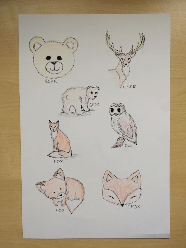
Out of all the illustrations the one that seemed the most 'cute' looking and fitting for a baby clothing company would be the fox. Bears seems to be used quite often but I have found that on Canadian and French clothing they do incorporate wildlife into their designs. Therefore I experimented with one of the fox illustrations in ink and watercolour however for branding it would be best to create the illustration on adobe illustrator this would mean that the image would be a vector and could be resized without pixelation. 


To ensure that the logo would work across a range of products both digitally and printed I decided to create the outlines in illustrator to create a vector this means that I can scale the image up or down across a range of sizes without having to redraw my sketch. 


After looking at various different ideas for my logo I figured that because I drew the fox in a circular shop the best way to incorporate the two elements would be to use the shape for the typography.


 I took these initial stages to my tutor Danny for some feedback and he suggested a few things that were incredibly helpful:

- Look at ways you can make the gap smaller between type and image.
- Research into colours, think about using bright colours within the colour palette as this isn't something that is usually created. 
- Look into luxury packaging and how you can put this together as a project not just a logo.
- Also think about how this can be pushed further, can this be made into a website? what products can be made? bags, boxes, tags? how else can this brand be applied?

Wednesday 7 October 2015

OUGD603: Brief 1- Research into 'style' and context

Before designing anything or beginning to think about ideas it is wise to consider what is already created and what is the dominant ideas/ ideals within designing for children and in particular children's clothing. The most important thing to remember about designing for children's clothing brands is that the product is designed for the parent. This is the case for tumtums as it specifically states in the brief that the product should be for young and fashionable parents. 


Mothercare is a lower price ranged high street store but their design is interesting to look at as it indicates what is wanted from parents. The logo itself is a soft and simple sans serif font which is something I want to use myself. 


However Mama's & Papa's even though high street is a little more expensive as seen in the photograph of a singer spotted shopping at the store. The design of the website is more simplistic and easier to use and this is also put across in their bags, packaging and products. The quality of their bags is also significantly better too which is something to consider when creating my own branding for tumtums. 

OUGD603: Brief 1- Logo Research

'Logo design is all around us. To the general public, logos serve as an instant reminder of a company or a product; to the client they're the point of recognition on which their branding hangs; and to us designers they represent the challenge of incorporating our clients' ideologies into one single graphic.'

http://www.creativebloq.com/graphic-design/pro-guide-logo-design-21221


I haven't often worked with design which is simplistic and digital so therefore this is an opportunity to create a logo using illustrator which can be used across a range of printed and digital products and ranges. A logo which is successful is one which must firstly be designed in black and white before considering colour. 

Already existing logos for baby clothing companies: 


Tumtums needs a logo which will appeal to a higher end market. However the problem with a large amount of baby clothing logos is that they are overly cluttered, complicated and contain too many elements. Much like the ones in the images shown above the large majority of logos contain a mix of fonts which are difficult to read and a mixture of pastel colours, this is because pastel blue and pink are the dominant colours for baby clothes. 

However Tumtums wants to aim for a audience of progressive young and stylish parents. This therefore means that understanding what is considered normal is important as this is something I need to break in my designs. 

From looking at this logo the elements I need to avoid in terms of branding for tumtums are the pastel shades of pink/ blue as they are stereotypical of baby clothing stores. Tumtums strives to be different and this could be done by selecting a different colour. The S built into the babies hair is a clever idea however it does also make it seem quite quirky and difficult to read. Tumtums wants to appeal to a variety of ages but more specifically a higher end audience who want to see a considered logo and for this to stand out as a simple clean design. 


In terms of cliche's for baby clothing stores as discussed above pastel shades of pink and blue need to be avoided due to the long lasting stereotypes and connotations the colours have. The logo also needs to avoid any overly obvious imagery as well such as stitching in the typography or a hanger like found in this logo. However the type which says 'baby boutique' is rather simple and a soft sans serif which is something I want to achieve within the new tumtums branding. 


Again, as a repeat many of the logos including this one include pastel shades as children are often associated with these softer colours. The typography in this logo is incredibly over flourished and is something I want to avoid when creating the tumtums branding. 


Elements within baby clothing logos I want to avoid: 

Pastel colours
High detail and unnecessary textures
Flourishes and 'stitching' edges
Thin scripts or childlike scribbly typography


What I want to achieve: 

Vivid colours 
A simple and bold design 
Clean cut and stylish 
Resembling a high fashion label 


OUGD603: Brief 1

Within the brief based on Autism last year I realised that I enjoy creating artwork which is directed towards parents. Therefore the tone of voice is incredibly similar within this brief. 

However this store is based in Canada so therefore it will be slightly different to the UK.


I have found from looking already existing Canadian baby clothing websites they are somewhat similar to the UK as they tend to use gender neutral colours. In my own designs I want to avoid using pinks and blues as this is quite over done and stereotypical. In Canada they speak both french and english so I felt for it to be worthwhile to have a look at some of the french stores and perhaps designer/ boutiques. 


All the stores although different have some distinctive qualities in their branding. 

The use of font and imagery within design for parents is quite soft in appearance and simple. The logo type isn't too complex and this simplicity makes the store much classier than some other examples I have seen. 

See below

Therefore the design I create needs to be simplistic, resizable, and most importantly readable/ legible. 

Fonts that seem to work best are those which are softer and more flowing, but I think experimenting with different forms of type would be more beneficial. However to start with I know I want to create type which has softened letterforms instead of a sharp sans serif or even serif. 

Sunday 4 October 2015

OUGD603: Brief 1 'Baby clothes with style'


Brief

A fun, creative baby clothing supplier in Vancouver called ’tumtums’ is looking for a rebrand. They would like something with custom lettering, fun, bright colours and an overall playful appearance. They have used a simple animal illustration in the past and are happy to incorporate something like this into the design. 


Background/ Considerations

Consider the tone of voice of the design; what would be suitable for a parent? There are several limitations and processes when creating branding which impact on the creation of the design. This includes ensuring all imagery created is suitable for print and web. 

Think about the customer and target audience of the store and how this impacts the design created as well as the cost of the printed material. How can the logo/branding be shown across a range of materials? What printing methods should/ could be used?


Mandatory Requirements

Blog posts and design boards to demonstrate your development process and evidence of relevant research, which has impacted your practice. 


Deliverables

A consistent brand created for ‘tumtums’. This will include a fully functioning logo, which should work both in black and white or colour across a range of materials.


(Briefbox) Images attached as style guidance


What needs to be created?

A new logo and brand identity for 'tumtums'. The brand needs to be fun and engaging for young and fashionable parents. The logo creation also needs to be shown in context across a range of different material which could include; shop signage, context of print or a look book, bags, clothing tags and labels, business stationary and perhaps even mocked up as a website/app for digital reproduction. 

Ideas and inspiration


Saturday 3 October 2015

OUGD603: Briefs Level 6

BRIEFS FOR LEVEL 6

Two visiting professional briefs

Competition brief: YCN released in October (campaign or packaging)

Competition brief : Penguin (book cover design) released in October

Competition brief: Feathr or Secret 7

Collaboration on course: Beth Taylor- Traditional Print collaboration screen print/ letterpress. (Currently writing our brief)

Collaboration off the course: Possibly with Sophie Wright from illustration- yet to be confirmed

Live briefs: The River Cottage Canteen in Plymouth- menu design

Coffee shop logo: Genaro’s Coffee House

Veggie’s Choice: festival food van graphics (typography)

Eddy’s cut throat barbers: complete rebrand


Tumtums: baby clothes branding