Type Hierarchies: Newspapers
The Citizen: Local Free Newspaper
Issue: December 18th 2013


The Citizen: Local Free Newspaper
Issue: December 18th 2013
Firstly, I noticed that with free newspapers they are mostly filled with adverts. In particular with these page I chose, the majority of the page is taken up by one large advert.
The eye glances at the advert first, however because the advert is so heavily filled with text and colour it seems to daunting to look at first. So therefore the eye will look for something simplistic, such as the title at the top. This bold type (black) is much easier to read and is therefore seen first.
Secondly, the advert title is then read, before looking at the brand name:
The colour and size of this text makes it stand out from the centre of the advert.
The eye is drawn to this because of the negative space and use of white, also the word "free" is in capitals and yellow, therefore standing out. The viewer moves on from the advert knowing that they could get something free.
As the eye is moving back up the page "final weekend" is read, this is vital information gained from looking at the advert and knowing that is urgent.
Afterwards the photograph of the story and the smaller amounts of information are read, this is because the eye moves towards what it was looking at before being distracted.
The rest of the article is then read to find out more about the story, however this is read after viewing the photograph and smaller sections of text because it is much easier to read.
The eye then returns to the advert to the read the rest of the information, this is because the viewer remembers seeing "free" and also "final weekend" therefore it must be urgent.
The viewer then reads the other articles, firstly the one with the large photograph, as the bigger the information is- it must be more important. This is also something I have noticed, the most important information is usually much larger or in a different colour.
Finally the viewer reads the least important information which is the smallest adverts:
However overall the whole page, the most important information seems to be the largest advert which dominants most of the page. As this is a free paper, the majority of the pages are created due to adverts- therefore these are designed to be most important and remembered.
Text Hierarchy:
The Independent: 31st December 2013
Initially the first piece of information which stood out at me was the advert. Much like my previous deconstruction, the advert within the newspaper seems to dominate the majority of the page.
The eye is drawn towards this because of the mass of colour (red) which is bright and stands out on the newspaper.
The information which in on top of the photograph is viewed next in conjunction with viewing the photo, this is because of its size and full colouring as it captures attention.
This circular image/text combination is then viewed next because the eye moves further away from the advert to the top of the page.
Once the eye has moved across the page and back to the top it views the title as this is quite bold and black (on off white) which contrasts:
Once the title has been read, the viewer then looks at the photograph because it captures their attention with such a shocking storyline. The rest of the article is then read, this information is viewed after the advert because it is much smaller and less eye catching in terms of its design.
The other side of the page is then read after this as smaller minor text:
I have also found that within this example of a deconstruction, the majority of the page is filled with larger text and adverts rather than actual written content within articles. When looking at newspapers myself I also found that broadsheet newspapers such as The Daily Telegraph that don't contain as many adverts, their articles are much lengthier and are often targeted at a middle class educated audience.
Text Hierarchy:
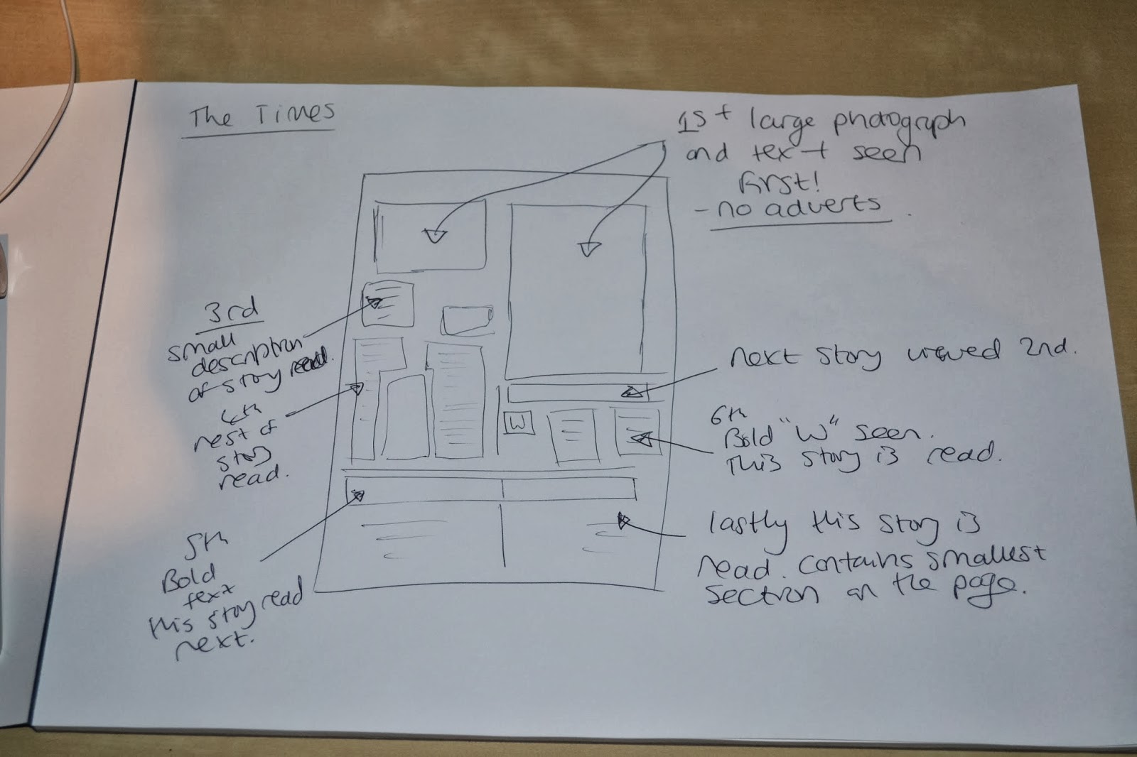
The Times: Issue- 31st December 2013
I noticed that with this newspaper article and throughout the majority of The Times, there aren't as many advertisements within the newspaper, perhaps suggesting that they have a bigger budget.
Within the article I found that firstly my eyes were drawn towards the large photograph, but in terms of text that is read, I then looked towards the title on the left:
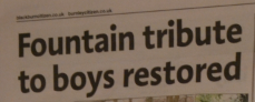
This is quite bold and draws attention to the viewer, however because this story is quite large the eye is then drawn to another piece of large text which is quite thin/light:
After viewing this the eye is then drawn back towards the article because of the photograph and smaller illustration, it entices the viewer to read the story. The larger text is viewed first before reading the full article.
Once the article has been read the eye follows the page down and reads the title which in bold, this captures the attention of the reader and therefore means the story is also read.
Once this has been read the eye then is drawn towards the large "W" above which also contains some red text, this story is then read next before following the page down and reading the final story. This is read last because is takes up a very small amount of space and therefore attracts less attention of the reader.
I have also found that through looking at newspapers, this example contains the most text due to its target audience (conservative) and also its target audience (slightly middle/upper classes) the amount of writing is much higher than other newspapers I have viewed. Even though this example does contain a large image, it also contains high volumes of text- I found that this contrasted highly when looking at magazine designs too.
Type Hierarchies: