Thursday 30 April 2015

OUGD505: Exhibition book cover (Task 5- Brief 2)

Study Task for book cover: 

Background:

Designing a book cover for a theoretical text is very different from producing a design for a novel.

People read theoretical literature for different reasons than they would do a novel.

Identifying these reasons will help inform a successful book cover.

It is also crucial to embrace the content of the book recognising the history, context and purpose of the text.


Workshop Task:

Go to the library (or buy a book) and find one theoretical book to examine in some detail.

Study the book and its content (you can read it if you wish but scanning its content can give you much insight into its content and themes).

You may want to look for any secondary texts written about the book or its author (on the internet for example) in order to get a more thorough grasp of its meaning.

When you return after Easter you will discuss what you have learned about the text with your peers.


Note:Level 4 students will be designing covers for books about Graphic Design therefore you are encouraged to look at some more "dense" reading material better suited to level 5.

........................................................................

I started off by looking through the list of theorists to identify which I would like to choose. By looking through a whole range of different philosophers and thinkers I found Aristotle's books intriguing and interesting as they are based on humans/animals and the soul/body.

I looked at all different books that he has written and one that stood out to me the most was 'De Partibus Animalium' which translates to Parts Of Animals. 

http://www.amazon.com/Aristotle-Animals-Movement-Progression-Classical/dp/0674993578


"On the Parts of Animals (Greek Περὶ ζῴων μορίων; Latin De Partibus Animalium) is a text by Aristotle. It was written around 350 BC. The whole work is roughly a study in animal anatomy and physiology; it aims to provide a scientific understanding of the parts (organs, tissues, fluids, etc.) of animals."

From reading sections of this book I found that the overall themes were based on the reasons why animals had certain features. Living things have similar components so instead of studying them individually it was suggested that they should be studied as a whole. Aristotle also suggested that animals and structures are products of nature and that their simple being has a purpose- their structure has a purpose. One of the points I also picked up when reading this book was that Aristotle suggests animal parts should be studied in terms of its cause- why it  has certain features.

"The same point applies to the natural things that seem to come to be by chance, as it also does in the case of things produced by craft" p209 This suggests that animals are a form of 'craft' because their form is for a reason, each part is considered as part of its making.

"If however, human beings and animals and their parts are natural then we should discuss flesh, bone, blood and all the uniform parts and equally all the non uniform parts for instance face, hand, foot and we should ask what gives each of them its character and what potentially is involved" p210

"since we must study the formal cause, we study the soul" p212 - this suggests that animals aren't just their structure but have a depth of soul too.

"nature is and is spoken of in two ways as matter and as substance"p212

"matter is its nature because of the soul"p212

From looking at the book and picking out quotes I started to create some thumbnail sketches of initial ideas.


1. (top left) The quote about matter and substance reminded me of the science particles and perhaps this could be made into a pattern or into the silhouette shapes of animals.


2. (second in top row) This thumbnail idea was simply to illustrate different parts of animals such as the heart, beak, blood cells, bone ect. As the book speaks quite heavily and in-depth about animal parts.

3. (third in) For this thumbnail I concentrated on the idea that animals and plants are put down to their basic structure which in turn means their cells. To combat this I thought about creating a book cover pattern which would incorporate simplistic and colourful representations of cell structures. 


4. (fourth along) This thumbnail was basically the idea of splitting an animal up into its basic structures such as its outer body, organs and skeletal form. 


5. (bottom left) Aristotle spoke about living things have similar components and most obviously most animals have lungs of some kind so I thought it would be interesting to illustrate this by including vital organs. 

6. (bottom row- second in) Aristotle spoke about species and the different types of animals so I thought that it could be an idea to show the different species in a simplistic illustrated format. 


7. (bottom row- third inwards) Within this thumbnail I drew a quick skeleton of a fish with the possibility of creating patterns based on fossils through embossing and perhaps other print processes to create patterns using animal structure. 

8. (bottom row- last) The last thumbnail was a quick idea from thinking of a graphic design perspective of Aristotle. He spoke about the structure of animals but perhaps there could be a way to portray this through design. The most obvious way of doing this was thinking about typography, each letterform has a structure to build it which is similar to Aristotle's view of the causes of animal structure and parts. To make this connection further I could experiment with hand rendering typography with animal structures such as bone and muscle. 

Within the interim critique I presented my book and the ideas/ thumbnails I have begun to form. They really liked the idea of using typography to illustrate animal anatomy. It was also suggested that I could look at some of the older illustration/books/typography of the time it was written and take inspiration from these for my own design. Especially when looking at typography I could take the basic structure from some of the older greek typography and merge this with an etched or scratchy textures within to form bones/muscle. We also ordered GF Smith stock samples as a group so I took this opportunity to choose older looking papers that were slightly textured but also a light/cool blue too. The brief states that only two colours plus stock can be used so therefore I will have to be careful with my colour choices- perhaps the colour could be used within the type such as the muscle tissue could be a shade of pink/red. 

From these I began looking at creating some digital mock ups:

I had started to look at diagrams of bone and cell tissue which created somewhat abstract patterns as a background piece however these would be quite conceptual and I'm not sure they would portray the book in a way which I would have wanted. 


I also looked into typography created from muscle and bone textures however they are incredibly complex and although they work as individual pieces as a whole it would be illegible and difficult to read. 


However I found some examples where this has worked incredibly well as one off pieces: 


http://talent.adweek.com/gallery/3172644/Muscle-Type-Free-Font

The fact that this is embossed further enhances the detail and texture created from such an intricate letterform. 

These illustrations of letter forms below were something I found incredibly interesting too whilst researching and it is something I would like to develop further perhaps in another project that would be more suitable:


http://luc.devroye.org/fonts-55989.html


http://www.notcot.com/archives/2008/01/anatomy-of-a-ty.php

Again this lettering is incredibly detailed and delicate which works wonderful on such a large scale however my book cover and poster will be on a smaller scale (a4 and b5) so therefore I think it would be wise to perhaps not develop detailed lettering as this would be difficult to read and perhaps use something much more simple and put the detail into an illustration. 

Examples of book covers:

Jessica Hische

http://papayablog.typepad.com/.a/6a01157258054a970b01676132162c970b-pi
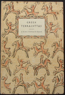
Enid Marx


http://www.penguinfirsteditions.com/kp/K54.jpg


http://payload264.cargocollective.com/1/0/12415/7599300/druid-book-cover.jpg

These few examples of designs and artists who have created illustration book covers which is how I want to approach my own design brief. Aristotle's book is highly detailed and older too which would be fitting to research into colour choices and fonts/ type which give an older aura by stock choices and illustration. 

Tuesday 28 April 2015

OUGD505: Methodology Workshop

methodology
noun
noun: methodology; plural noun: methodologies
a system of methods used in a particular area of study or activity.
"a methodology for investigating the concept of focal points"


In terms of graphic design and my own work methodology is important because it feeds into the development of my work but also gives design decisions reasoning and depth, designs are not made from mindless decisions they are in fact developed through a process of research. Having a methodology affects my own design choices because it influences my initial research this means that the research I undertake is for a purpose for instance with OUGD505 my primary research in talking to bloggers who have autism or know people who have autism meant that I was able to gain information which has led to content for my book which I will be able to use in my design- the research becomes the content because it is presenting information which is sourced with purpose. I contacted those individuals to find out information about autism so therefore it was research with a purpose to gain particular information from a specific audience. 

The methodology of my graphic design is vital to the development of my projects/briefs because the choices I make feed into the designs themselves for example the J20 brief for OUGD503, I made choices in the use of colour by talking to individuals who do not drink alcohol and asked what they wanted from a soft drink- they wanted something mature which actually meant shying away from and changing the brief slightly and showing why I have done so with justifications in my choice of using the colour black. This was also important in my contextual research for the children's penguin cover I created- through reading the book and looking at current and similar existing books it allowed me to gain insight into what children strive to look at which isn't necessarily safe- the book contained links to death and somewhat darker themes so therefore the book reflected this- in this instance my methodology fed into the research as my design decisions were influenced by the text I had read and thinking about the audience's needs. 

Methodology influences design choices because it feeds into the research for example the audience must be researched to determine what they need and want which also links to the tone of voice used in the design this needs to be determined by the audience. For instance the brief I am working on currently for OUGD505- the booklet I am creating is for parents and therefore the tone of voice needs to be firm but friendly to allow the audience to feel confident and to trust the publication. However if the booklet of information was made for children for example, the tone of voice and purpose of the booklet would be entirely different. Methodology will also provide a vital part of future briefs and into level 6 as improving my understanding of design and also the contextual reasons behind them will allow me to create designs which have purpose and justification. Through using research it will allow me to create work which is useful for a particular audience and therefore my choices will not just be for aesthetic reasons- they will have in-depth understanding of why certain design decisions have been made.

In terms of my feedback I have found several ways to improve and move forward:

I need to simplify my design concepts and work on experimentation as I sometimes try to do too much work/content.
I also seem to do work that could be considered quite safe (illustrative safe zone) so therefore I need to try new styles which are different and take risks more even if they don't work as well. 
I need to look more at contemporary influences and layout design to develop my work from traditional layouts. 
It was suggested that I should work more with typography as this is something I have not done much of therefore I will try to concentrate on my use of type in the future. 

Monday 27 April 2015

OUGD505: Task 3- Disobedient Objects


Module ID: OUGD505 Module Brief: Product Range Distribution

Module Leader: Danny Cookney Module Deadline: 22/05/15 (14:00)


Brief Deadline: 22/05/15 (14:00) Outcomes Assessed: 5A7, 5A8, 5B5, 5C6, 5C7 
Studio (Task) Deadline: 30/04/15 (15:30) 


Task

Background:

Understanding the needs of specific layouts for specific jobs is key to your development and practice. There are many times as a designer that you will have to consider differing formats for layout due to clients’ needs and also the need of information.

This one week task is a practical exercise that will highlight layout skills and understanding of application of text, point sizes, columns, margins, gutters, image, page size, bleed, scale, format, pagination, fluidity, audience and composition.

You will be given dummy type / text / images to work with during this task that is studio based. You will be given instructions per layout requirements and also a context to help you decide how information should be positioned and organised.

You will be expected to add your own design flourishes upon these designs, where appropriate.

You will share visual representations of your work with a partner / small group. 

Layout 1 – Minimal Text / image: A5 Flyer

Layout 2 - Text Heavy / Imagery: Concertina spread (10x A5 pages)

Extended Practice:

As soon as you have completed your flyers and brochures, you are expected to extend the range of design across platforms. Suggestions are: Poster / mail shot / tickets and appropriate mediums. 

___

Disobedient Objects North Brief 1

Background:

This simple layout will ask you to utilise a short amount of body copy, title, date, and location. The minimal amount of text allows for the simple use of single imagery and the type to serve as the main visual elements.

Brief:

You are asked to produce a simplistic flyer design for a 'Disobedient Objects North' Exhibition at the People's History Museum (www.phm.org.uk) using the instructions below.

Specifications:

Format: A5 – Portrait

Title: Disobedient Objects North

Sub-Title: In Association with the V&A

Date: August 3, 2015 - August 29, 2015

Location: People's History Museum, Manchester.

Contacts:

www.phm.org.uk

www.vam.ac.uk 

Image: Single exhibit-based image, People's History Museum logo, V&A logo, 

Use of two colours only: Black and white

(Use embedded InDesign file and follow grid.)

Save as PDF file.

___

Disobedient Objects North Brief 2:

Background:

This text/image heavy layout will ask you to utilise body copy, title, date, and location, heading, sub heading, imagery, indexes, highlighted quotes. The amount of text allows for the use of imagery and the type to serve as the main visual elements.

Brief:


You are to layout and design a 10-page concertina folded brochure for a forthcoming exhibition titled ‘Disobedient Objects North’ at People's History Museum, Manchester. All images, copy and branding are included. You have to create a visually stimulating layout that showcases the artists’ imagery but does not sacrifice important information in this process. The images and information must flow harmoniously and offer a taste of what is to be expected during the exhibition. One further consideration may be whether you emphasise the 'North' aspect: whether the materials need to offer a distinction between this and the V&A (London) exhibition from 2014-2015.

Branding elements must be kept to black and white. Images must be unaltered and in colour.

Considerations:

Headings, headlines, body copy, grid, type, colour, image sizing, bleed, margins, flow, audience, narrative, language, purpose, size, external print methods, preparing for print, stock, distribution.

Specifications:

Format: A5 x10 – Portrait – Concertina spread (front and back).

Title: Disobedient Objects North

Sub-Title: In Association with the V&A

Date: August 3, 2015 - August 29, 2015

Location: People’s History Museum, Left Bank, Spinningfields, Manchester, M3 3ER, United Kingdom

Introduction:

Disobedient Objects is an exhibition about the art and design produced by grassroots social movements. It includes exhibits loaned from activist groups from all over the world, bringing together for the first time many objects rarely before seen in a museum. 

Additional info:

From a Suffragette tea service to protest robots, this exhibition is the first to examine the powerful role of objects in movements for social change. It demonstrates how political activism drives a wealth of design ingenuity and collective creativity that defy standard definitions of art and design. Disobedient Objects focuses on the period from the late 1970s to now, a time that has brought new technologies and political challenges. On display are arts of rebellion from around the world that illuminate the role of making in grassroots movements for social change: finely woven banners; defaced currency; changing designs for barricades and blockades; political video games; an inflatable general assembly to facilitate consensus decision-making; experimental activist-bicycles; and textiles bearing witness to political murders.

Additional info:

Disobedient Objects How-To Guides

Disobedient objects are often carefully designed solutions to problems faced by activists on the ground, in the midst of social and political movements around the world. The exhibition includes several take home guides on how-to make some of these objects, from Book Bloc Shields to Tear-Gas Masks. Made available with help from many of the activists who created these objects, the guides were illustrated by Marwan Kaabour at Barnbrook. Additionally, these are now available online at www.vam.ac.uk.

Additional info:

Essentially Disobedient Objects is an exhibition about out-designing authority. Looking beyond art and design framed by markets, connoisseurs and professionals, this exhibition considers the role of social movement cultures in re-making our world from below. Disobedient objects can be ingenious and sometimes beautiful solutions to complex problems, often produced with limited resources and under duress. Working by any media necessary, they may be poor in means, but they are often rich in ends.

Disobedient objects have a history as long as social struggle itself. Ordinary people have always used them to exert counterpower, and object-making has long been a part of social movement cultures alongside music, performance and the visual arts. While these other mediums of protest have been explored before, this exhibition is the first to look broadly at material culture’s role in radical social change. It identifies these objects as part of a people’s history of art and design.

Additional info:

When looking at making which places itself in social movements’ conditions of production, we have tried to select objects which embody an important or notable moment in their histories of making. But it is far from an exhaustive survey. We hope this exhibition will be a starting point to get beyond easy stereotypes and open up objects of social movement cultures as an area for further study.

Quote:

"First they ignore you. Then they ridicule you. And then they attack you and want to burn you. And then they build monuments to you." — Nicholas Klein

Contacts:

www.phm.org.uk

www.vam.ac.uk 

http://www.vam.ac.uk/blog/section/disobedient-objects

Images:

Disobedient Objects ident / V&A logo / People's History Museum logo

Multiple Exhibit imagery

(Use embedded InDesign file and follow grid.)


Save as PDF file.

Print proof copy if possible, but not essential.

Extended Practice:

As soon as you have completed your flyers and brochures, you are expected to extend the range of design across platforms. Suggestions are: Poster / mail shot / tickets and appropriate mediums. 


Mandatory Requirements


Completed flyer design.

Completed Brochure Design.

Completed work to be posted on to your Design Practice blog and tagged with OUGD505 Studio Task 03.


Deliverables


Flyer Design saved as PDF file.

Brochure Design saved as a PDF file.

Extended practice, which is expected but not limited, to posters, mail shots, tickets, way finding. 

Optional printed physical outcome, but would be preferred if possible.


We also aim to document the group's studio process plus the generated work within a blog post at www.phm.org.uk

The first step was to look at the websites as I had previously visited the exhibition in London. The exhibition space in manchester is much more intense in terms of its graphic design- the use of black and darker colours definitely show the types of work exhibited here. However the V&A is designed much simpler with large photographs and simple typography. In my publication I need to find a way of incorporating these two elements.


The "north" element of the artwork is suggested as important as a new element. The logo for peoples history museum is much like a sticker and is therefore quite fitting with the protest theme of the exhibition. When visiting the exhibition a lot of the artwork was handmade and quite 'loud' and bold. Therefore the header text I will use should also be quite bold and stand out. 

A5 flyer:


The flyer was specific in that it had to include particular elements/content as well as being black and white. I used a brush type for the title of the exhibition as this is representative of the political protest artwork pieces but also taken from inspiration of graffiti which is known throughout manchester. I used gill sans because it is simple and easily read in a wide range of weights which would be perfect for the concertina booklet. 


The booklet/concertina

The initial grid- 


The booklet:

The artwork of the exhibition is the most important so therefore I tried to create most of the pages with full or partly larger images which flows over more than one page. I used photographs from both the exhibition but also related imagery too given in the pack. I tried to use the body copy throughout the booklet in smaller columns so it could be easily read. See below for the mock up I created for a possible print of the concertina booklet.  


I also continued the type/ image usage into a colour poster for the exhibition too:


Friday 24 April 2015

OUGD505: Brief 1- Autism: Statement of intent critique

The critique feedback I received was incredibly helpful as it reaffirmed in my head what it is exactly I need to create and that I need to ensure the information I use is condensed because the ASD spectrum so is so widely varied. They agreed that the target audience for my publication being for parents would be perfect as it means that the cause and reasoning is related. It was also mentioned that I could perhaps show autism as a spectrum in the form of a concertina book but I explained that this wouldn't be suitable as each individual person with autism is entirely different- there isn't necessarily a scale as such in severity. It was also mentioned that I could use case studies too and use a compare/contrast approach but again I don't believe this would be helpful due to the fact each individual is entirely different. However helpful tips were that I could include information about treatment and what help is available for parents and children- this would allow for a friendly feel to the book and make the experience of diagnosis less intense. But moving forward now I need to ensure I collect my information which is relevant from my previous research I've come up with a few different sections: what is autism? why act early? and the early signs/ treatment. 

OUGD505: Brief 2- Exhibition

Brief title: “Covered”

Undertake research to uncover a notable ‘thinker’ – a theorist or philosopher – whose concepts or views resonate with you. While not an exhaustive list, you could, for example, consider any of the following:
Adorno
Aristotle
Barthes
Baudrillard
Benjamin
Butler
Chomsky
Confucius
Deleuze
Derrida
Descartes
Foucault
Freud
Haraway
Lacan
Marx
McLuhan
Mulvey
Nietzsche
Plato
Rousseau
Sartre
Schopenhauer
Spinoza
Žižek

Following your initial engagement, locate one publication that documents the work of your chosen thinker and develop a design for a book cover that capably communicates something about its content. Your submission is in two parts:
An A4 poster print of your proposed cover that is produced using a process of your choice. This should be limited to two colours plus stock.
A completed jacket design including front, back and spine complete with blurb, publisher logos, ISBN numbers, etc. Again, reflecting some of the constraints in book publishing, this should also be a two colour (plus stock) design.


For design inspiration, you could investigate the work of:

Richard Amsel

Phil Baines

Jonathan Barnbrook

Ana Boavida

Saul Bass

Rodrigo Corral

Germano Facetti

Bill Gold

Andrea Guinn

Carol Hayes (http://www.boldextended.com)

Jessica Hische

Chip Kidd

Claudia Klat

Peter Koch

Russell Maret

Enid Marx

Peter Mendelsund

Olly Moss

Jason Munn

Patrick Nowell-Smith

David Pearson

Christopher Sergio

Sroop Sunar

Helen Yentus


Background / Considerations


Think visually, explore both literal and lateral responses. Explore working with text and image, both combined and separately. Consider the various techniques and processes that are available to you and their suitability for conveying or reenforcing the ideas that you are trying to communicate.


Mandatory Requirements

Two Colour print plus stock for completed designs.


Deliverables

Final printed A4 poster and digital print of final completed book jacket design.

Two design boards which provide a condensed overview of your research, process and design decisions.

Design Practice blog. 

Tuesday 21 April 2015

OUGD505: Brief 1- Colour Research

Before beginning the design of my book I firstly wanted to look at the psychology of colour in relation to health and children among sensitive topics. Health booklets can often appear daunting because they use clinical colours such as large amounts of white and primary colours which you would find on posters. By also using a bold font in this combination they can often appear quite emotionless and detached from the audience. With a sensitive topic like Autism and child development the choice of colour and design decisions are completely vital in the making of my book to have the right tone of voice which is suitable for parents. 


I found looking through this book incredibly interesting as it mentioned about how colours can be connected to emotions and ways in which people think. The first page that I looked at that would be useful for my project was 'sentimental' as the colours are connected to calm surroundings this would be useful for parents because it would allow them to feel more relaxed in reading the publication rather than something which is clinical and detached like the previous research into health campaigns. 


The colours are incredibly soft and when designing I could perhaps use these for inspiration for backgrounds and when creating a set colour palette. A similar colour palette from the book is shown below called 'restful' however these are much lighter and more like pastel shades which is something I will need to experiment with whether is be different stock or simply colours of ink.