Wednesday 26 November 2014

OUGD504: Brief 4- Task

Task to create a design board/mood board including:
 audience, message and tone of voice.


Formats I could use: Larger poster as the main part of the campaign which grabs attention with smaller flyers which can be taken away. Also what could be useful is using something even smaller which someone can simply place into their pocket. 


The example from MOO online printers shows how a website can be promoted with a small amount of information, this could be deemed as useful for events such as the RSPCA tent I have shown above on the design board as they can be placed securely in pockets. 

OUGD504: Brief 4

Brief 4:

augment
verb
ɔːgˈmɛnt/
make (something) greater by adding to it; increase.

Your task is to produce a print-based advertising campaign across at least 3 print-based advertising deliverables (e.g. poster, flyer, billboard, etc.) to accompany your 'A brief history of...' website that features an (or some) element(s) of digital interactivity. There are several methods, platforms and technologies available that can be exploited in providing interactive elements to print media therefore it is important that you research these thoroughly in order to develop an effective augmented design.

In order to produce an effective advertisement you must consider carefully factors such as:
audience
communication
distribution
content
materials
quantity
time-frame
printing method and cost

During the planning stages of this project you will show that you have considered each of these factors through a project rationale.

Your advertisements will be print-based with your deliverable outcomes printed to a high standard. It is expected that you are to adequately prepare your design work for a commercial print eventuality - this process should be documented on your Blog.


The ubiquitous nature of digital technology and web access means that having a web and/or digital presence is essential for businesses and organisations. That being said, print media is a proven and everlasting method of communication and marketing. Therefore, businesses and organisations are seeking creative and exciting ways of marrying the two. This is an emerging area of design that breaks down assumed barriers between print and screen-based design and presents many opportunities for creative design strategies.

As this is an advertising brief that focusses on production factors in advertising design it is expected that you will commit to significant research into advertising methods and strategies as well as current trends.

Special considerations must be made to the potential and limitations of production methods used in the creation and distribution of advertising media.

Digital technologies present their own set of unique issues and obstacles which can make or break a creative augmented design project. Therefore you must show that you have considered potential issues and thoroughly tested your work in context.


On-going research, experiments and decision-making must be documented in your design practice blog.

Your advertisements will be print-based therefore you must make special considerations in regards to print processes, cost, quantity and adequately preparing your design work for this.

You must show evidence of an understanding and appreciation of emerging strategies and technologies in augmented design and interactive print whilst also being aware of its limitations.

Correct labelling of your work on your blog is essential. Failure to organise your work clearly will affect the assessment of your work.

Your project must be summarised and presented neatly and coherently on design boards.


Digital design work suitably prepared for commercial print.

Final advertisement outcomes printed to a high standard.

Evidence of research into augmented design and interactive print.

500 word evaluation

Tuesday 25 November 2014

OUGD504: Brief 3- Final Design & Evaluation

Homepage screenshots: 

Desktop


Tablet/ smaller laptop


Mobile


I am pleased I have been able to introduce artwork which makes the desktop view appear more full, however I have coded it to remove it using a media query so when the website is smaller it disappears therefore making the website quicker to load for mobiles. 

Grooming:

(Desktop, tablet & mobile)


I had some problems with the grooming page when put onto a larger desktop screen as there seems to be a glitch which doesn't appear with any other screen Ive tried it on. On the right hand column at the bottom one of the sub headings doesn't line up correctly and this is something I have been unable to fix. 

Livery (desktop, tablet, mobile)


Diet: (desktop, tablet, mobile)


Saddlery (desktop, tablet, mobile)


Stable (desktop, tablet, mobile)


Costs (Desktop, tablet, mobile)


The costs page has been the most difficult to change in terms of its responsiveness on mobile usage and I think if I had more time I would change the design of this to be able to split into different divs and therefore work as a one column. This is the only page on the website that doesn't seem to work at all. 

Evaluation 

I have found this brief incredibly challenging for several different reasons but most obviously because I have never worked with the mindset of screen based media before. Research helped me further understand how websites work with colours (RGB), fonts which can be used and also layouts and navigation however I still think this has only been an introduction for me and I find it incredibly difficult to process all the information. I have enjoyed being able to create something from the research I collected and for it to be of use however because the brief initially was to design a website and code it I firstly researched websites and engaged with online teaching methods such as code academy and w3schools. This insight allowed me to understand how I could make a website which I would be able to code, which in turn I have been able to complete. However since the brief has been changed to only submit a digital file on the day of the final day of the brief I didn't think it was wise to rethink all of my designs as I had spent a long time on them. Instead I will submit the index file one a pen drive/ memory stick. 

I am pleased that I have been able to produce a website that does actually work and is in fact responsive to different sizes of screen. However if I had known that the brief was going to be changed to only submit a digital file I would have pushed myself to create something more imaginative as I initially wanted to use photographs and layering, but instead made the layout simplistic and worked with detailed sketches to create a more quirky and countryside themed artwork style. 

The knowledge I have gained from this brief will allow me to perhaps create my own website which could work for PPP or through using an online resource. But having the knowledge of understanding how web works as a medium is definitely an added skill set even though I feel as though I am more confident and comfortable with working in print. The feedback overall throughout the project has been quite positive and I think if I had a greater understanding of coding and website design I could of made my design look a little more professional such as the costs page (larger image) which I struggled making responsive. 

The colour scheme which I worked on changing from the initial blues and grey tones works much better and fits with the sketchy drawings I created. The neutrals along with the wood background definitely give the design a slight warmth and 'aura' of countryside and a stable environment which would definitely suit the target audience of possible horse owners. Overall I am not completely happy with the final design I have produced as to me it appears quite unprofessional due to the illustrations that could of worked better with print as when researching there were very few websites that used illustrations, perhaps if I were to complete it again I would use photographs or vector graphics. 

However I think the simplicity of my design works for the amount of copy on the page, if I were to redesign it I would create it so images could be however over and the body copy would appear once hovered, this would make my pages look much cleaner however this does require java script which I am unsure on how to use. I am pleased I have been able to include all the information I wanted to on the website which therefore means the website is accurate and correct on giving advice to potential horse owners therefore completing my purpose to "inform people about the basic fundamental elements of horse care and stable management". 

Monday 24 November 2014

OUGD503: Feathr submission

Feathr also retweeted me which I think helped with people actually viewing the design!


The design on the website: 


After a couple of days of my design being on the website I was already on the first page!(Sunday 23rd November)


And now by checking on Monday 24th I now have: 


I have also received a comment "Would look amazing as a feature wall in a study/studio!"

Saturday 22 November 2014

OUGD503: Feathr Briefing

Tom from "Feathr" came into Uni to talk to us about the brief and the projects they are running. It was interesting to hear that all three of the creators were previously working in advertising and they wanted to change their profession to working with creatives. 

The brief is to basically rethink wallpaper as a form of artwork instead of decoration. Wallpaper is often seen as background noise and they want to recreate it to sell to an audience who enjoys good design, so it can be used as the feature of the room. 


Their 8 tips:

1.  Tell a story & have a concept
Great art switches your brain on and gives you a new perspective. 
2.  Be the talking point in the room
Decoration matches the carpet.  Art blows minds and inspires love.  Your wallpaper should be a conversation piece. 
3. Think about scale and context
What's good on screen might not pop on the wall. How does the viewers’ experience change as they approach the wall?  What do they see from 5m away?  What do they see from 5cm away?  
4. Play with layers and depth.
Paper might be 2D dimensional; your artwork does not have to be. 
5. Subvert the medium
Wallpaper comes with a barrel of expectations and conventions – so play with them, break them, use them, upend them.  Art subverts and reimagines.
6. What’s your repeat?
You don't just have to straight repeat.  Think about how different repeat types change the pattern.
7.  Don't fear colour
Wallpaper doesn’t need to hide in beige and blondes.
8.  Vary with the repeat
Wallpaper is a repeating artform - so create small variations to maintain the interest to the eye. 

What is used as existing wallpapers? (Examples from standard shops)


As I was simply beginning to look at wallpapers on different stores online I found that the lower market prices offered limited artistic merit and creativity. However I had a visit to a shop called Graham & Brown which sell designer wallpaper, I found I was more interested in their designs but this higher quality is impacted by the price. The lower costing wallpapers seem to all be a repeat pattern of some kind which is either floral or damask. 

Therefore with creating my own wallpaper I need to look at how I can show my own personality and interests as the 'artist' as the buyer of these wallpapers will be interested in the story and the person behind the wallpaper as well as the final design. So I am going to start off with mind mapping my interests and how these could link to wallpaper. 


Initial ideas- Animals: "a house isn't a home without a dog" 


http://www.pets4homes.co.uk/images/classifieds/2013/12/13/506826/large/quality-jet-black-french-bulldog-puppy-52ac4f5230b11.jpg

Holidays & Europe- I tend to like visiting the beach on holiday and collect photos and shells which could work as a wallpaper.

Picture of shell collections online:


http://oceansreach.com/wp-content/uploads/2012/11/shell-collections.3JPG.jpg


http://images.fineartamerica.com/images-medium-large/shell-collection-christine-page.jpg

Books & English Literature 
My location will be on the design so it could be fitting to base the wallpaper from some of my favourite writers who are from the area (Brontë-  Jane Eyre, Wuthering Heights).
The books have a connection with the Yorkshire Moors and the town Haworth.


http://www.moviemurmurs.co.uk/wp-content/uploads/2013/02/photo-Les-Hauts-de-Hurlevent-Wuthering-Heights-2011-1.jpg

Baking and craft of cupcakes: 


Music 

I am interested in many genre's of music and it is also a creative discipline much like graphic design. At the moment due to artists such as Amy Winehouse with her old school voice and Lady Gaga with the release of Cheek to Cheek Jazz is being brought back into society as a popular music genre again. At the moment there seems to be a demand for music which is different due to the popularity of house and electronic music. Therefore musical instruments are popular, and out of all the topics of interests I think it would be most important to include music as a wallpaper. 

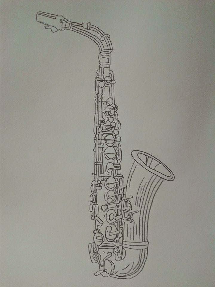
For me personally I see Jazz as including instruments such as the saxophone and trumpet and even though all instruments are fantastic, I was brought up by my family with music tastes which include saxophone not only from older music but from groups such as Madness. One of the most famous musicals which has an incredible soundtrack is that of Chicago and that is why I have chosen to name my piece as "All That Jazz". 


http://upload.wikimedia.org/wikipedia/en/9/9b/Chicago_original_poster_art.jpg


"Jazz is a genre of music that originated in African-American communities during the late 19th and early 20th century."

characterised by improvisation, syncopation, and usually a regular or forceful rhythm. Brass and woodwind instruments and piano are particularly associated with jazz, although guitar and occasionally violin are also used; styles include Dixieland, swing, bebop, and free jazz.

Personally I see Jazz as both quite a classy and sophisticated genre but also quite fun too. This is why in the images above we can see monochrome images which look more sophisticated and colourful imagery which is influenced from the energy of the songs but also its African American roots. 


My drawing:


Watercolour experiments to introduce colour: 


Although I don't think the colours are bold enough to be a statement/ feature wallpaper. 

Bold colour edits:


My drawing when scanned in looked much like a dark grey when in fact I wanted the fine liner to look sharply black and modern looking rather than a more rough sketchy style which I have done previously especially in the website brief for horse care in OUGD504. 


I tried a few other colours with black as a background as I thought it may allow the colour to stand out more, however I'm not sure about the pink it looks too feminine. 


I experimented with a few different colours and backgrounds before trying these onto the website to experiment with the different types of matching the tiles up in a repeat. 


Using s smaller version of the imagery definitely doesn't work because it becomes a blur. 


The pink as stated before is definitely too feminine and music should appeal to all genders. 


The ones with texture don't work as a wall piece at all because they break up and I think the colours appear too harsh, therefore I think I will experiment with using black and white with different uses of tiling on the paper. 


My favourite is definitely the half drop as it fills the page, as I saw some of the examples on the website had used a smaller scale for their artwork I felt it was important to use a larger scale which would therefore create impact for the wallpaper rather than being background noise. There are three different options for furniture to place with the wallpaper and I think the hat stand would work best. When asking for feedback on my design they suggested that it would look good in an office or a studio, or perhaps a character house or flat with a long hallway. 

Final design (and uploading)


I had decided the half drop pattern would work best for this design: 


Description in the form of a paragraph:

Recently I heard a 'busker' in Leeds Train Station playing the Saxophone. It inspired me to create artwork to celebrate traditional instruments and specifically the genre of Jazz.

I am happy with the final results as I only gave myself to complete this brief, the simplistic design of the wallpaper definitely works because it draws attention to the illustration which took me a while to complete. I think this design would work quite well for selling after speaking to some of my friends who are music lovers. I think the design could also work with different colours to suit people's personal tastes. I have really enjoyed creating artwork for this brief as it has allowed me to express one of my own interests and use illustration as it suits to brief. The only way to know whether this design will be successful or not is by the reaction online by people voting for it so I will blog the progress my design makes (hopefully).