Friday 22 May 2015

OUGD505: Exhibition

The exhibition at the library: 


It was really interesting to see all of the work together at the four/five exhibition as usually I wouldn't see everyones work for most briefs. There were some beautifully printed pieces which included processes such as foiling- this is something I haven't tried yet but possibly should if future briefs were suitable. Level 4 did really well with organising and creating material for the exhibition too. 

Tuesday 19 May 2015

OUGD505: Module Evaluation

Overall I have thoroughly enjoyed researching and creating for such an in-depth brief (1) my subject choice has been incredibly demanding in terms of the amount of research I did and narrowing this down to one problem that needed a graphic solution was difficult. As with any political/social/environmental issue there are many elements and angles I could have taken but I chose one specific loop hole in the current health care system to create a graphic based solution for. Currently there is very little information about Autism for parents and so due to this fact I am pleased I have been able to produce a booklet which has purpose and would bring a positive impact to helping people get an earlier diagnosis. 

In terms of the design I created I found it extremely challenging because not only was I dealing with how to portray a large amount of information but I also gave myself a second challenge in producing work which is completely different in terms of my usual graphic 'style'. I usually approach briefs with illustration or some form of 'quirky' look which can often work with the briefs I choose. However I have enjoyed being able to research into more minimal layouts and info graphics too as this isn't something I have ever thought about doing before. I think this is a step forward in being able to create work which is out of my comfort zone. 

With the second brief I found my main struggle was with working in a short amount of time to the deadline of the exhibition. However due to my experimentation in the responsive module I have gained more faith in myself that I am able to produce work quickly that is still effective in terms of what the aim of the piece is. It has been interesting looking into theorists work and being able to produce a book cover design which works in the context of a library exhibition. I am looking forward to seeing my work in the exhibition and how it looks alongside all the level 4/5 students book covers too. Throughout this module I have felt more confident in making design decisions and taking part in crits/ asking for feedback which is an improvement upon previous modules and has definitely helped me develop my work further especially in the first brief. 

OUGD505: Brief 2- Evaluation

This brief was interesting to create work for as it allowed me time to look at books by various different theorists. As we had to produce a design for a book which is non duplicated I decided to go for Aristotle as not many would choose such an old philosopher and writer. Looking at his work now after knowing and learning about current writers based on evolution and the form of animals it was interesting to see his early theories of how animals are made up and why. His suggestion of body and soul is incredibly interesting and of course my love for animals outside of graphic design is what influenced me into creating a design for this book. Of course I also enjoy reading older books too as for COP last year I created artwork for a William Morris based brief, creating artwork with an older aura is something I enjoy which I also applied to this brief too. 

I focused much of my time on the first brief as this was much larger in terms of research and context however I believe I have been able to create a book cover which is reflective of Aristotle's works but in a more simplistic and modern interpretation. Due to the short amount of time I had to produce artwork for this brief it meant I didn't have much time to experiment with the many ideas I had initially sketched out which is disappointing. 

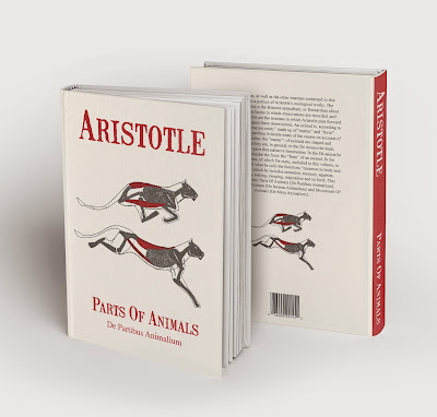
Despite this lack of time I have been able to produce a design which contains small elements of the theorist's work and ideas. Aristotle speaks about bones and animal structure so therefore in my illustration I simplified a lion into a more illustrative style rather than a traditional study- this ensures that the cover isn't too busy. 

My research into older printing techniques and greek books is also present in my type and colour choices. I had looked at traditional elements of type which includes letterpress, even though I didn't have time to use traditional printing methods I used a font which is textured much like my illustration the use of texture adds a form of character to the book cover which ensures it isn't too polished or modern looking. As the book is of quite an age I wanted this to be a vital point in my design which is why I spent time researching into different stock before deciding on my final one. If I had more time to produce the print of my final piece I would of spent some time screen printing or perhaps learning how to letterpress however due to limited time I had focused on the design for the exhibition. 

OUGD505: Brief 1- Evaluation

The booklet I have created for brief 1 I believe is successful in terms of its purpose for the target audience. I am pleased I have been able to produce a piece of graphic design which would have a positive affect on gaining early diagnosis in children. I set out to achieve a product which would be useful and contain correct information and content along with having a friendly and open approach in its design. I believe I have achieved both of these as I spent a long time researching the information I have included and rewording sections so that they are the correct tone of voice for parents as they want to read something which is short, personal and non threatening. 

The colour scheme I used enhances this tone of voice as it is brightly coloured which ensures it is interesting to look at and easy to read. The colours I have used are also non specific in terms of gender or race/culture and therefore are suitable for all parents. This was also relevant in the illustrations I used too as if I created imagery which was more feminine or masculine this wouldn't of been suitable- in the same way portraying a mother and baby would isolate other parents and couples who do not fit the dominant ideology of being a heterosexual parent. The publications I had previously looked at for healthcare were incredibly dull and often quite clinical, for which I have created a design simply the opposite. The advice for changing the font in the crit were extremely helpful as Avenir suits the vector illustrations I used and enhances the friendly and rounded nature of the whole design however it is much more legible in terms of a header font and would ensure the viewer could see this on a shelf full of booklets. 

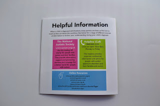
The infographic elements help break up the information into smaller chunks which are easier to read and therefore seem quite simple to look through. I have kept the pages with body copy to minimum but in some instances it was necessary as the information was vital. I struggled with the double sided printing and on a couple of the pages they don't align up fully but this is due to the printer not being completely to the mm when printing on both sides. However if this was printed on a commercial scale I have no worries that it would look more professional especially with its binding too, I used a simple staple to bind the book so that the information wouldn't be interrupted which again could be used on a commercial scale. 

Overall I am pleased I have been able to showcase vital information for parents in an interesting and friendly way which is entirely different to regular health publications. The booklet would be found in doctors surgeries, bounty packs and given out by midwives at early developmental stage check ups. This information if put into use would ensure that children could benefit from an earlier diagnosis and parents would gain an understanding of their child's behaviour too. What makes this brief successful in terms of personal progression is that I have been able to prove to myself that I can create work which is of different styles and approaches but I simply need to push myself more and look at a range of different graphic design resources to understand what is needed for the brief as if I had created my design in my usual quirky/sketched/illustrative style this might not have been as successful or appealed to younger parents who perhaps prefer something quick, simple and colourful. 

If I had more time I would like to of experimented with papers which perhaps had a more tactile and textured feel to them and looked at ways in which the pages could be bound with stitching as this would of enhanced the idea of it being quite human- however this would be costly and only suitable for one off pieces. The design I have created works both printed and as a digital publication so therefore could be shared on both types of media, the simple printing and stabled bind would be ideal for cheaper cost as the more experimental approaches I spoke about would be suitable for a higher budget. 

OUGD505: Brief 1- Print in context

In terms of distribution this 12 page saddle stitch book could be easily printed using commercial printers such as precision ect. I would need a different size to the ones stated which may cost more but I had a look at an idea for pricing: 


The booklet is for parents who may be concerned about the signs of Autism but most importantly it is about raising awareness for early detected. To enhance this message it must be placed in the correct contexts and locations for it to be affective. The most common places you will find my booklet would be in development clinics such as the nurse/midwife section in a doctors surgery but also as part of the bounty packs given to new mothers. The publication is something which is physically printed and easily read due to its minimal layout and large amounts of space, the friendly nature of the design fits in well with its context (see below). 


However due to the fact that new mothers and parents are now using online resources more often I have made it into an online document too. This is so that it can be easily shared on social media between parents but also can be added as a link to charity websites for example as a resource of information. 


Monday 18 May 2015

OUGD505: Brief 2 (exhibition) Final Print

 Poster for the exhibition: 4/5 


 Full book cover:


Details of textured stock and illustrations:


Mocked up as a book cover:


OUGD505: Brief 2- Stock choice/ Development

Stock:


The use of stock with my design is incredibly important as I want to ensure that it has an older aura to it. I looked at various white/cream/brown/neutral shades of stock including some I had ordered as samples from GF Smith too. However through comparing them to some of the older versions of the text some of them seemed either too yellow, too white, too dark so I tried my design printed onto a few different examples to see how it would look (see below). 


The design: 


It was suggested that the design needed some space around the top and bottom because it felt too fixed and formal therefore I did a few thumbnails of ideas on how I could combat this in the most relevant and effective way. 


Development of layout:

I tried the book cover with moving the type to the top and bottom thus adding space around the illustration and type however I feel the type at the top and bottom feels more balanced and looks much better now space has been added to it. 


Before/after:


Printing onto different stocks:


I found as expected that the white was too harsh and I needed something softer however when looking at off white stocks in the library they seemed incredibly yellow and not authentic at all. However I did find a much thicker ivory coloured textured stock which had a similar thickness to water colour stock- this would be perfect for my design as the colour is authentic looking and the small amount of texture will compliment the illustration and type used too. 

Design ready for print:


In terms of continuing my design into a full book cover jacket I wanted to ensure that is was still quite minimal as the front cover as many theoretical books seem quite full and busy. I have simplified the type on the front and back to ensure there is as little as possible and have introduced the red colour onto the spine so this breaks up the front and back. The block colour with red and the ivory would stand out on the shelf as the spine is quite bright too. 


OUGD505: Brief 2- Development of type

Typography choices:


From the previous examples for inspiration based on older greek and letterpress books I looked at a range of different fonts, the ones that were more successful were garamond/baskerville because they look quite traditional. As the book is incredibly old I want this to be a feature within the cover and therefore should have some form of traditional and older elements to its design. Of course Aristotle's works are written in Latin and from looking at older typography this is still used and carved into grave stones for example. Another form of older type in books is through using a press, the ink is often not fully applied onto the page so therefore it leaves a texture like my illustration. 

Below are some examples of lead letterpress type I described previously:

https://theartrag.files.wordpress.com/2013/08/plantin_letterpress.jpg


http://cdn.ilovetypography.com/img/2009/04/letterpress-minatures1.jpg

The bottom front on the samples at the top of this blog post would therefore be most suiting because it is traditional in its serif form but it also works well alongside my illustration due to elements of it not being fully formed- it has texture and therefore portrays  the age of the book I am making a cover for. To match the illustration I created I chose to make the typography red much like the titles of the older books I looked at. 

OUGD505: Brief 2- Research into context/colour

Aristotle's works were written many years ago so therefore there has been several editions and translations of his work. From looking online at versions of his work and others around a similar time I have found that many were created on old presses or with ink by hand. The colours used were often purely black or sections of them were red. The poster needs to be two colours plus stock so therefore before considering the imagery used I am going to use black/grey ink along with red and an antique stock of some kind (an off white) this is to incorporate the age of the book even if the design is quite modern. 

"Red ink in manuscripts goes back at least to the fifth century and flourished until the fifteenth. It must have been the spread of printed books, in which producing coloured text is very complicated, which eroded the doubtless standard medieval assumption that books were black and red. Printed books are just black, which is duller. Vermilion is mercuric sulphide, and is turned into red ink by grinding up and mixing it with white of egg and gum arabic. Red ink can also be made from brazilwood chips which were infused in vinegar and mixed with gum arabic. Brazilwood, one should explain, is not a native of South America - the country was named after its abundance of the well-known trees already familiar to makers of medieval red ink." 

http://web.ceu.hu/medstud/manual/MMM/ink.html

You can see below some examples of how red is used to highlight important elements such as titles and writers. 
This could be used as some form of spot colour on my book cover:


http://www.think-israel.org/jul07pix/palestine.book.jpg


https://tseday.files.wordpress.com/2008/09/bahera-haszab1.jpg

I also found older editions of Aristotle's books which include imagery it is often softly drawn or etched with lots of texture in grey/black. From looking back at my initial sketches it could be worth thinking about how imagery could work in this context. 

http://upload.wikimedia.org/wikipedia/commons/4/49/Aristoteles_Logica_1570_Biblioteca_Huelva.jpg


Creating the illustration: 

http://tstf.co/blog/wp-content/uploads/2012/07/Lioness-leaps-to-attack-crocodile1_thumb.jpg

Skeleton:

https://chasingsabretooths.files.wordpress.com/2013/05/compar-lion-homother-body-skel-low-res.jpg


Animal drawings: Cave/ prehistoric art

http://madamepickwickartblog.com/wp-content/uploads/2011/05/lascaux9.jpg

Initial sketch:

From looking at the detailed skeleton and muscle structures of a lion I simplified the lines into a structure which included small segments of muscle and bone but wasn't over complicated this ensures the book cover still feels quite modern instead of incredibly detailed studies. 


I chose to illustrate this in pencils rather than ink or fine liners because a the inks in the older books I have previously looked at seem to be much softer and delicate. Using harsh lines could also draw attention away from the details in the illustration. 


Scanned in: When scanned in it seems incredibly pale so therefore through experimenting with photoshop filters of colour this should ensure I stick to the 2 colour maximum. 

From the research above I had decided upon using black/grey ink and red so therefore I looked at the tones of red I could use and created swatches. 

Choice of red:

http://digitalsynopsis.com/wp-content/uploads/2014/09/color-thesaurus-correct-names-red-shades.jpg

I want a red that isn't too vibrant and can be representative of body colouring. The reds used in the inks of the older books I had previously looked at were a much richer and what I would describe as a classier red rather than something which is quite brash and bright. 
I created a few swatches below on the one on the far right seems to be perfect as it isn't too dark but is still a vivid red. 


Added filter:


From adding filters I felt as though the grey was more successful as it isn't as harsh as the red or black however I liked elements of these so I will try putting red into sections of muscle to be representative of inner organ colours. 


Adding red to the muscle sections:


This is something I feel is much more successful than what I originally started out with as it is softer, includes simplistic lines and also textures which mimic the textures you'd get with an etching or with traditional printmaking methods. As with minimal time I will be unable to produce this in a traditional way I have tried to mimic this through digital editing however if I were to complete this with a longer time scale I would try and create this illustration into an etching or perhaps a larger screen print. 

OUGD505: Brief 1- Final Prints