Brief 2 Development
These are my two initial letterforms from my first brief to begin manipulations on Adobe Illustrator, they represent the idea of occupation of space through the use of line. The letterform "C" shows the idea of shadows and light, the second being "I"which shows how buildings work in three dimensions.
After completing these first few developments I feel as though the idea of three dimensions would work better on illustrator, this is because I feel it would best portray "occupation" due to my research and looking at my primary photographs of shadows (windows).
From a few of the tips that I found out from the Illustrator inductions I began experimenting with letterforms based on ideas that I had previously with my hand rendered typefaces in my first brief. I also found that on illustrator it becomes much quicker to create fonts to be three dimensions and to cut into them with the eraser tool, I will further develop these ideas of pattern and three dimensions further in my next workshop session.
Fritz Lang 1923- Metropolis (Poster created by Boris Bilinsky)
http://thisisanauthorsblog.files.wordpress.com/2012/03/metropolisposterlarge1.jpg
From looking at my first brief (based on occupation- of space) I had experimented with the idea of three dimensions and how letters can fill/ occupy space. In my Illustrator workshop the tutor looked at my hand rendered designs and he stated that he thought my use of the font Futura was similar and reminded him of the "Bauhaus" and german design as well as this poster for a silent film. Through looking at further research based on this idea I have started to experiment with three dimensions as well as angles and the depth to which the letterform is/ the amount of space it occupies. From my previous research for my first brief I also began to experiment on these letterforms by using shading and the use of light within illustrator (based on the idea that light/ silhouettes occupy space visually). I have also experimented with the idea of the letterform being full and quite large but also taking away parts of the letterform through the eraser tool and then finally allowing the letterform to just be an outline and appear empty.
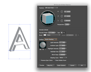
Firstly I experimented with my initial ideas of three dimensions from my "I" in brief 1. In Illustrator I experimented with the 3D extrude and bevel effects by creating outlines. On the second letterform I experimented with adding a "bevel" (texture) to the letter A which made it appear to be structured much like a building- however I feel as though my initial idea from brief 1 would work better to take sections out of the letterform.
Within these designs I experimented with creating the letterform into outlines rather than a whole letter. This shows shadows and the outline which follows from my previous research into shadows occupying space. However I don't feel this would transfer to other letterforms to keep the letterforms to be legible and readable.
I experimented with cutting into the letterform but leaving it two diminutional, I feel this would work incredibly well in terms of readability and legibility because it is simple- however it doesn't reflect my initial ideas. I also tried leaving the centre of the letterform empty and just using outlines (much like the letter D in my first brief). I feel this works well however the amount of lines could be highly confusing and therefore make the letterforms illegible.
Within this letterform I experimented with black half tones (opacity) as I felt the gradient I had tried earlier wasn't suitable (too intense for letterforms). I also rotated the letterform onto its side to represent the idea of the letterform being a structure/ building and therefore occupying more space.
I experimented with the lighter tone and found when I printed it off it was incredibly illegible and therefore want to pursue the darker half tones. Within this image I also experimented with a thinner form of three dimensions which would be more legible as text which could be used as a header- however I feel the larger three dimensional text works better (occupies more space).
Within these screenshots, I experimented with adding a "bevel" to the letterform, as well as experimented with direction of light in relation to the shadows within the letterform, however the bevel within the letterform makes it complicated and I won't include this in further developments. I will also increase the size of the letterform in terms of its three dimensional aspect.
Within these letterforms I experimented with completely removing the centre of the letter so it just becomes an outline (empty). This works on a large scale, but when made smaller is incredibly illegible because the lines/ strokes are too close together.
After considerations of this to not work I experimented with removing parts of the letterform and I feel that on a larger scale this would work- however this brief is to create a full alphabet, so therefore I will disregard this idea.
From asking a few people their general opinions on my initial designs they stated that I should take forward this idea of three dimensions but experiment with the colours used, they thought that the grey tones worked best but felt that I could experiment further with the idea of shadows and cutting sections out of the letterform. I feel from this feedback I will further experiment with illustrator on my designs to create different shading due to light and perhaps use drop shadows as well as intersect sections of the letterform.


No comments:
Post a Comment