I started by looking at the quotes I wrote out from the book and beginning some thumbnails:
It seemed to me that some of the most vital elements were the trees and the descriptions of them so I took some photographs in a forest/woodland. I found that when visualising my ideas through quick drawings that the best ideas were that of the woodland and also the use of the skull and therefore representing the scarier elements of the book. There are many descriptions of witches and magic throughout the book along with the screaming skull curse and personally this is definitely something I want to focus on. "Druid" from "druids bottom" (the house they visit) actually means: "a priest, magician, or soothsayer in the ancient Celtic religion". This therefore reinforces the idea of superstition and magic throughout the book.
These were taken with a long exposure and zoomed in and out in one shot to represent the idea of running and panic especially in the descriptions of carrie.
There were also many descriptions about the trees being above and scary (children are small) so therefore I took some shots whilst laying on the floor. Therefore increasing the ominous tone. I also tried this shot with a fish eye lens but I'm not sure this would work for the cover.
These were also photographs I had taken but more with a leading eye perspective, although I like these I think they are a little tame and don't have impact which is what the cover is intended for.
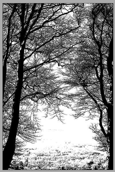
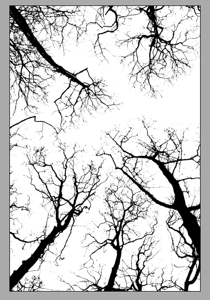
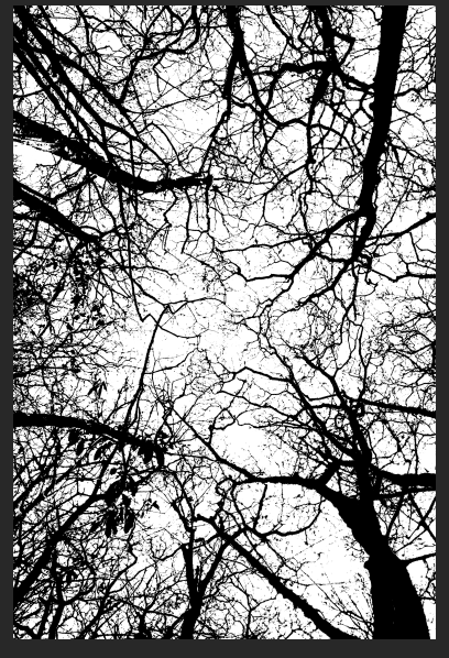
Even though I enjoyed taking these photographs and experimenting with my dslr, I'm unsure as to whether their realistic qualities appeal to children, therefore I will take them into photoshop and experiment a little. I used filters in photoshop to create silhouettes.
The photographs which use long exposers didn't end up being affective when edited as it is difficult to see the detail:
I also tried some of the other shots edited however they appear too much like a christmas card and are too friendly, the cover needs to represent the scary elements of the book.
These were definitely my favourite experiments because they appear be more "scary" which is what I was aiming for. However there are lots of gaps so I will try and layer different images over each other, I tried it in black and white:
However I felt that the black on white background looked more like trees, so therefore I tried different colours. I firstly started with blue as a basic colour which is quite neutral before I had a research into colours linked to magic.
I found that when researching purple is the colour which is most connected to magic:
This color relates to the imagination and spirituality. It stimulates the imagination and inspires high ideals. It is an introspective color, allowing us to get in touch with our deeper thoughts.
"Purple or violet assists those who seek the meaning of life and spiritual fulfillment - it expands our awareness, connecting us to a higher consciousness. For this reason it is associated with transformation of the soul and the philosophers of the world are often attracted to it.
In the meaning of colors, purple and violet represent the future, the imagination and dreams.
The color violet relates to the fantasy world, and a need to escape from the practicalities of life. It is the daydreamer escaping from reality.
Artists, musicians, writers, poets and psychics are all inspired by violet and its magic and mystery.
Deep Purple: Dark purple is related to higher spiritual attainment.
Amethyst: A mystical color, amethyst opens intuitive channels. It protects the vulnerable and assists the humanitarian. It is the color of the evolved soul. "
http://www.empower-yourself-with-color-psychology.com/color-purple.html
Dark purples and reds/blues definitely remind me of gothic images, it is often described as creepy and elegant which would be perfect for my book cover.
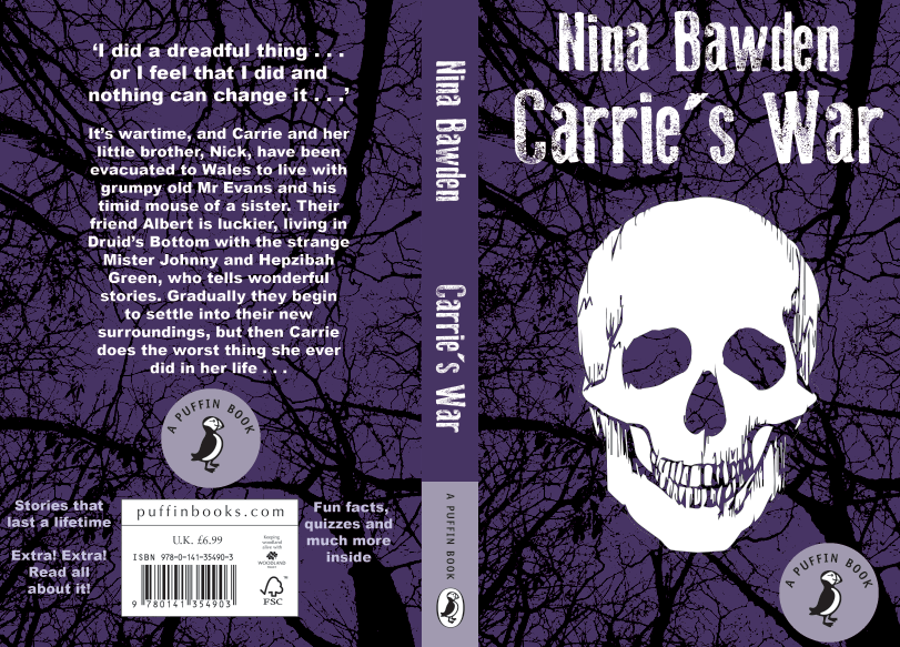
Using white text on a darker background definitely helps the writing stand out, for the blurb I used arial black which is quite bold and helps it stand out from the chaotic background.
I attempted a few times to edited the image so it left a space for the penguin/puffin logo but it didn't seem to look correct, therefore in the end I ended up using a circle. (see below)
The cover really does not work with a white background and coloured text, so therefore I might try using white text and making the front cover's background darker.
The font that I initially tried to use I quite liked but felt perhaps it was a little too childish for older children, however I found that making the author's name slightly smaller balances the composition much better.
The use of darker purple and lilac for the penguin/ puffin logo's is much softer than using white and creates impact and directs the eye to the text (white) instead of the logo. However I think perhaps a stamped text would appear much better.
I eventually managed to find a stamped text which was completely free to use and I quite like it as it reminds me of the ration books and the stamps used in war time, however due to the colours it appears modern and would appeal to children.
I also added an illustrated skull and tried it with a black outline however I felt using the same purple was much softer and less intense.
I had drawn lines in the eyes and nose areas however I felt as though these would be better clear to allow for the trees in the background to show through.
I needed to add spacing along the spine although I'm not sure using the same font for both the name and the author works, so therefore I asked a few people their opinion and they agreed that I needed to choose a different font or add kerning.
I though it would be best to stick to a sans serif font because the current cover uses serif's and it looks too formal for children. Therefore this is my final design:
I sent the png to a few people for feedback:
Oh I like It! I don't know the story line but as a visual it looks really good and it doesn't look childish which is good, looks like it's for the right age.
It looks very gothic and very you! Looks great!
I think it definitely looks like the scary elements of the book you were talking about.
I think this is really great feedback and I have been able to complete the work quite quickly as I gave myself a shorter deadline. I have got 5 briefs to complete so therefore there is a limited number of weeks to complete physical work, the largest amount of time was spent reading the book and analysing what information I felt was important to portray and what my specific thoughts were on the book itself. I am quite pleased with the outcome of this brief as I think it portrays the darker qualities and themes within the book and the quotes that I have specifically looked at. The cover I have produced I think also moves away from the idea of wartime and looks more at the narrative which the children are part of, their adventures and perceptions of danger and a 'scary' environment. What I have chosen to concentrate on is completely different to the usual perceptions of war and I feel would therefore appeal to a younger audience as it makes the book stand out from other war themed books which are already out there.
The submission is actually in January so should I want to change parts of my design I will have time to do so.
Update: I submitted the design-
The submission is actually in January so should I want to change parts of my design I will have time to do so.
Update: I submitted the design-


No comments:
Post a Comment