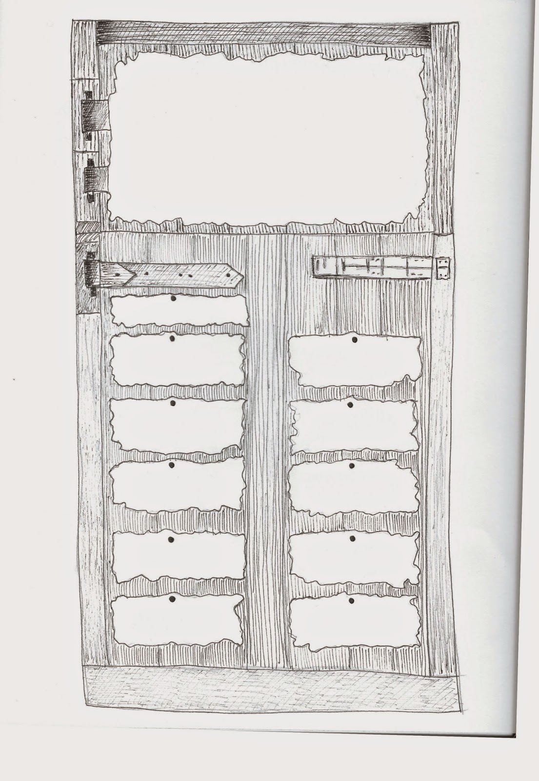
The costs page is entirely different because it has smaller amounts of body copy, therefore I thought it would be interesting to use a stable door to create a table rather than a simplistic maths table/grid. I have drawn this in the same etched/rough style as the others to continue the visual aesthetic.
Scanned in drawing:
However when I added all of the text I found that it seemed to look too black and I decided much like the other pages I needed to include white to some extent.
I found that the best result would be to use it for the numbers as this is the part I want to highlight.
Homepage (index) looked entirely empty so I decided to look at what imagery I could layer behind it: (own photographs)
However I the compositions above didn't work with the logo at all as they do not frame it well, they contrast with it.
I decided to look at one of my favourite photographs from the summer brief:
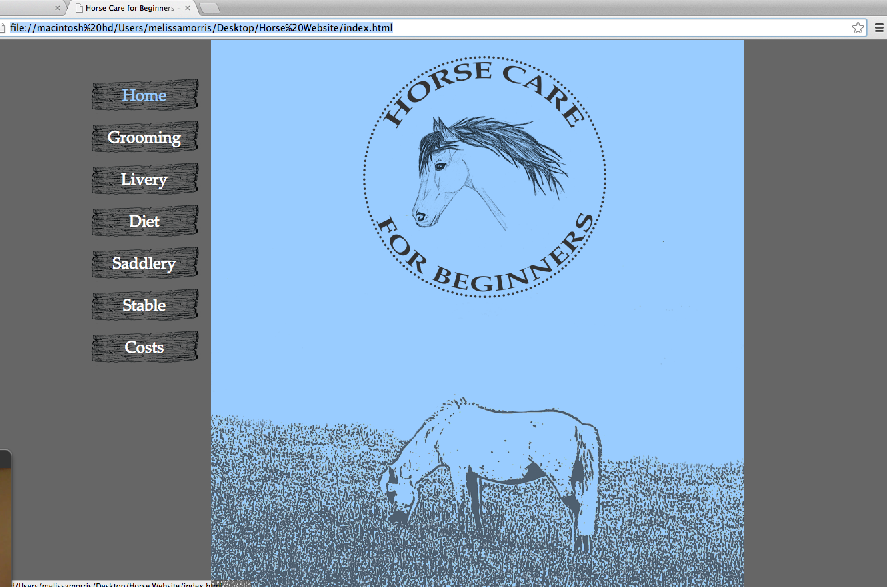
I edited the photograph on photoshop using filters of the blue and white web safe colours I have already been using to keep the imagery consistent.
However the background looked too white and when looking at it in conjunction with the other pages it didn't seem to match in colour scheme so I decided to change the photograph to dark grey and the background to the same blue as the other pages which therefore makes the website look consistent.
I decided to edit out the hills from the background which allowed for more negative space and i felt as though this picture framed the logo much better.
I am much happier with the outcome for this, however it might take a while to get the image to work correctly when placing it in the coding.


No comments:
Post a Comment