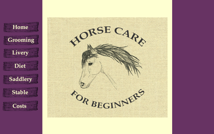
To create the homepage I wanted to keep it incredibly simple and just have "Horse Care for Beginners" on it. To ensure that it instantly portrayed equine care I decided to quite obviously use a drawing of a horse. I initially thought about using a silhouette but from the imagery and content I have already created I thought that it would be suitable to continue with using a fine liner and a cross hatching/ rustic style.
I initially started with just an outline but began developing it by adding layers of darker sections into the mane and also softening the face by adding shading to the muscle and bone structure.
Type to go with the drawing:
I began looking at different fonts and felt as though I should try a hand rendered font to go with the drawing style I have already created. However the script font wouldn't work within a logo because when it is smaller is quite hard to read.
I tried a few different variations and attempted to curve the text round because the shape of the drawing of the horse has a natural curve in it's neck. However I think these forms of typography look too childish in their form and as I am trying to mainly appeal to adults this is not the aura I want to portray.
Towards the bottom of the sheet (bottom right) I quite liked how the serif font looks as part of a logo. Equestrian sports can be seen as quite sophisticated and formal so I think the mix of a formal type and traditional rustic/etched looking drawings would work quite well with colours.
I quite like the use of blue here but not with the cream as the use of warm and cool colours definitely does not work visually.
I tried using a purple and red because it was suggested to me that these colours as seen as quite sophisticated and classy, although Im not too sure on how these look.
http://www.vergacar.ch/index.php
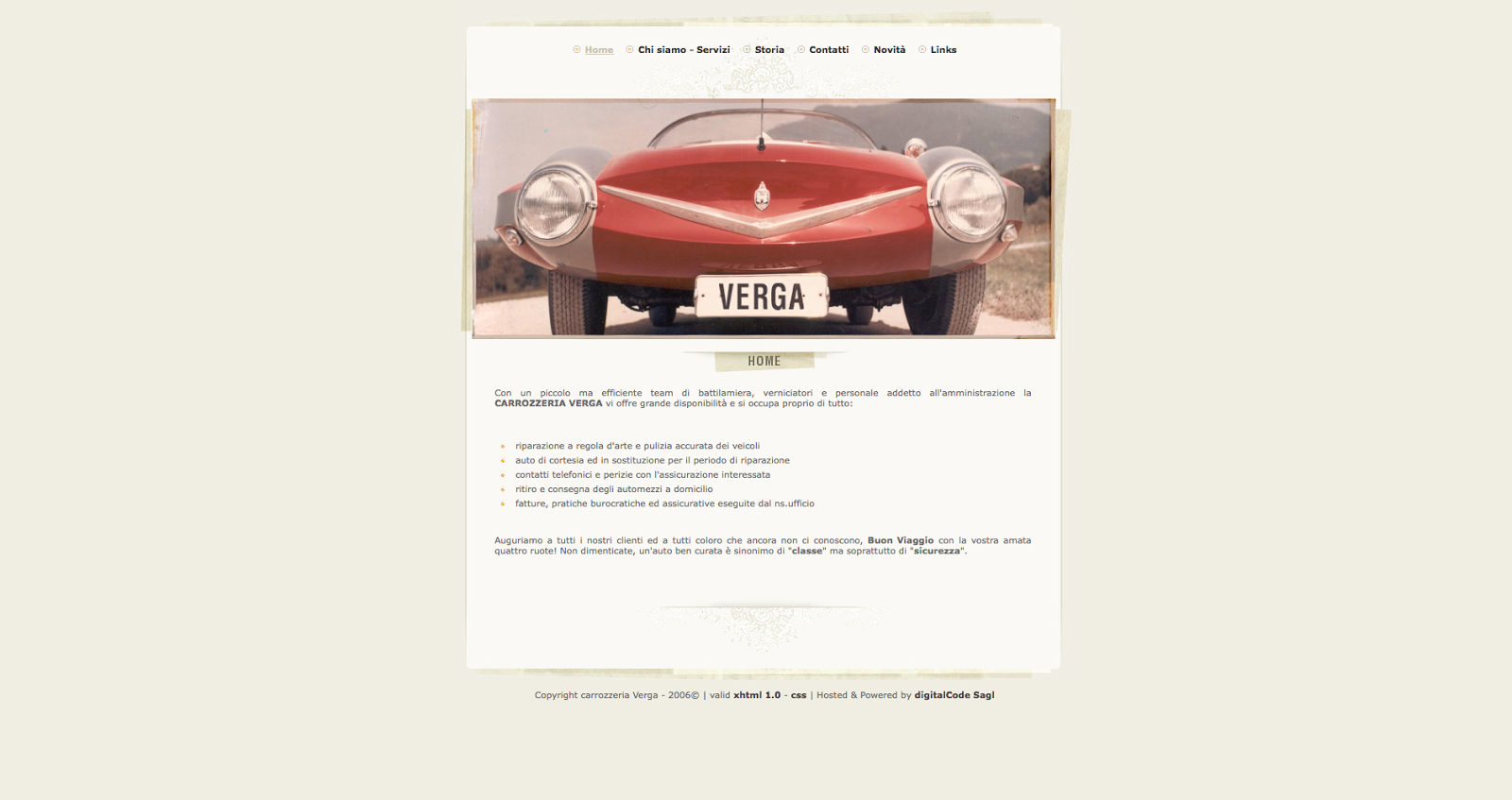
When looking at website designs I liked that the information on this page was centred and framed by a coloured background which could be something I can include in my design on all of the pages. Especially since this is something I had looked at in my thumbnails the use of a border frames the content when there is small amounts of information. This means that the page doesn't appear too empty and using negative space sometimes can mean the page simply looks unfinished.
http://antiquepianoshop.com
When researching into layout I came across this website which I felt had a perfectly balanced composition and suited the information I am using. This layout of small amounts of type which is aligned in the middle along with illustrations looks simplistic but easily read. This definitely suits my intentions for having design which is easily read and viewed.
http://www.vergacar.ch/index.php
If I knew more knowledge about coding and computer techniques it would have been interesting to see how some of the illustrations could be created as gif's such as how to use the brushes from the grooming kit.
http://www.woosterhound.com/en/#about
I also liked the skeuomorphic design of this website and if I had the photographic and editing skills/knowledge to make mine look correct I think this could of worked incredibly well. However I am quite limited in my knowledge on coding and adobe suite skills so therefore I need to make my website simplistic to make it achievable.
The cream makes the actual content on the page look like a textbook rather than work as a website. I think I need to experiment with colour because white and cream as the background of the content makes the information seem too daunting as it resembles a textbook page. Even though the purple and cream combination works really well on the homepage it definitely does not work with content. Therefore within the crit I will about other's opinions on colour.
What I took to critique:
Interim critique
From taking part within the interim crit I found that the logo needs to be changed. I gained positive feedback based on the illustrations and content I want to use for the website. There was also positive comments about the serif font used (Palatino) as they felt it was suitable for adults and gave an aura of sophistication which follows with the general representations of equestrian sports. Within the crit they stated that I could change the logo so it forms into a circle which I will experiment with as I think that would be a good idea. (Changes to logo as seen below). It was also mentioned that I could experiment with making the website more interactive with animations however I don't feel as though this would be suitable for adults as it would be too confusing and distracting from the content/information.
I also received mixed feedback about the textures I used behind the buttons where resemble somewhat of wood. They stated that it could be considered a stereotypical horse website and I was told I should make it minimal. However I also received feedback which contrasted this and said I should create all my type as hand rendered however after researching this it would actually lower the entire SEO (search engine optimisation) of my website. This means that if the links and headings were hand rendered they would all have to be saved as an image rather than text. This would therefore mean if the website was live it would be difficult to search for in terms of content which would defeat the research and purpose of my website in terms of its user experience and audience. It was also suggested that I could use natural colours based on rural influences such as the colours of leather and the countryside as a whole. However as a website I felt as though the cream and tan colours made it look like a textbook rather than being interesting to look at. Therefore I found that from looking at charities and what colours they use a blue is quite a calm and welcoming colour even though it is considered cold.
Examples of animal logos that use blue:
Why is blue used for charities?
Blue colour meaning:
"This color is one of trust, honesty and loyalty. It is sincere, reserved and quiet, and doesn't like to make a fuss or draw attention. It hates confrontation, and likes to do things in its own way.
From a color psychology perspective, blue is reliable and responsible."
"This is a colour that seeks peace and tranquility above everything else, promoting both physical and mental relaxation."
"The color blue is idealistic, enhancing self-expression and our ability to communicate our needs and wants. It inspires higher ideals."
"Blue is conservative and predictable, a safe and non-threatening color, and the most universally liked color of all, probably because it is safe and non-threatening."
http://www.empower-yourself-with-color-psychology.com/color-blue.html
"Light (sky) blue: peace, serenity, ethereal, spiritual, infinity
(The origin of these meanings is the intangible aspects of the sky.)"
http://www.colormatters.com/blue
Meanings in other countries:
"Blue's global similarities are significant:
Blue is the #1 favorite color of all people.
53% of the flags in the world contain blue.
A dark blue suit is professional business attire.
Aristocracy is blue-blooded in all European languages.
Unique Meanings of Blue in Different Cultures
Greeks believe that blue wards off "the evil eye.
The English “to feel blue” has no equivalent in other languages while in German “blau sein” (literally: to be blue) means to be drunk or in Russian “голубой” (literally: light blue) means to be homosexual.
Dark blue is the color of mourning in Korea.
The god Krishna has blue skin.
Shades of blue are described as shallow or deep instead of light or dark in China.
“Prince Charming” is called “The Blue Prince” in Italy and Spain."
http://www.colormatters.com/blue
From looking at this I have concluded that blue in the UK is seen as a calm and responsible colour that people can trust. It isn't too threatening like red or warmer colours and because of its softer and cold qualities is much like white. Blue is safe and tranquil and I think it used quite often for charities because they want to appeal as calm and nurturing but not too feminine. As I found with experimenting with colours that are similar such as purple I didn't want my website to appear too feminine as it should appeal to both genders. Using a softer blue provides colour but it doesn't distract from the information. Blue is actually considered to belong with nature such as the sea and the sky so therefore it could work quite well for representations of animals. Using a brighter colour I feel would make the website more appealing to younger people rather than using creams and tans as this looked quite bland and uninteresting as a website when I experimented.
The logo I initially began working on didn't seem to full create a circle. Therefore I used the warp tool when creating type which can create an arc.
However this wasn't warped enough to curve into the shape of the circle. Which definitely suits the purpose more as it visually follows the shape of the horses neck.
I also tried out different line weights whether it be dashed, dotted or full and I think the dotted affect makes the logo look more like a digital stamp. The thinner point using 1pt instead of 3 definitely works better because it doesn't distract from the type.
Although I'm unsure as to whether this will work at this size and perhaps it could be slightly smaller with a background image. I will need to experiment more inline with coding the website.
Grooming page changed to blue to match:
The grid follows a three div layout with a centred header and paragraph along with two columns. The other pages which include livery, diet, saddlery and stable also follow this grid layout. However the content for the homepage and costs page doesn't follow this rule because there isn't much body copy. I have mocked a few of the other pages up with the same style. I chose white as the headings instead of black because it seems to split the sections up visually instead of being all black with no breaks in colour.


No comments:
Post a Comment