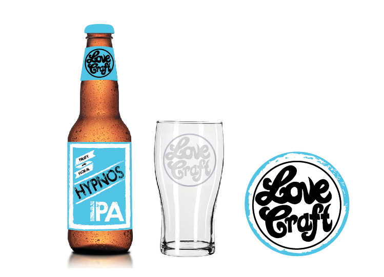
The beer I wanted to mock a design for was their product called "Hypnos".
Hypnos IPA: Our flagship IPA is crafted in the Pacific North West style of balancing fruity and floral hops with a light malty body that leaves the palate refreshed. It's an easy drinker, not overly bitter, and has a bouquet of wonderful hoppy aromas.
When I searched what Hypnos meant I was informed that it is intact the greek god of sleep so therefore I asked a few people what they felt the colour of sleep should be and they suggested using blue because it is quite a calm colour. Colour options:
http://whitecubediaries.files.wordpress.com/2013/03/pantone-blue-color-chart.gif
Sketches for layout:
I initially tried using a teal colour but felt that didn't look quite right so decided upon a bright blue which would stand out on the shelf in a supermarket.
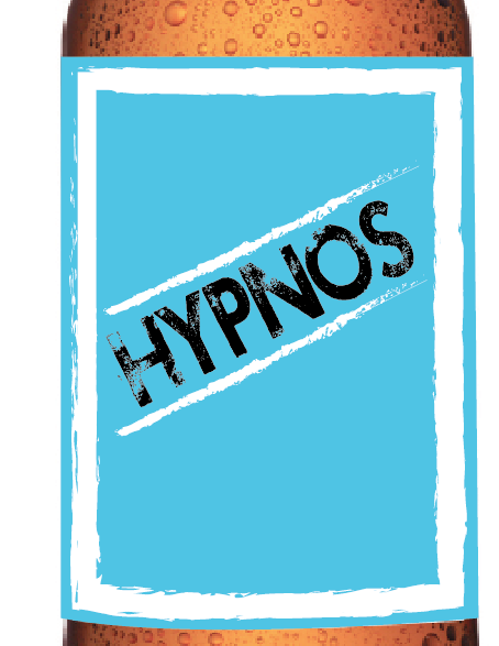
I quite liked the idea of using a font which showed craft and perhaps one which was textured to show their personal involvement but also adding part of their rural roots through a rough and gritty look. I think this really works well with the contrast of the bright colours which show their progressive and forward thinking ideas in terms of their creativity in brewing.
I changed the border from black to white as I feel the idea of "hypnos" (god of sleep) should be much softer and they state this beer is quite easy to drink compared to the other choices.
I thought about using a banner to incorporate the idea of tradition into the labels and perhaps this could be used for the name or the flavours.
Although I felt the lines were too harsh so I softened them much like the outline to make them appear more friendly.
I tried several different fonts but in the end went for one which appeared quite natural looking and reminded me or rural old fashioned stamps and the whole impact of the logo seems quite friendly due to the lines not being too harsh.
However I noticed when designing that the H in Hypnos wasn't as strong or had as much impact as the other letters so I went in and retouched the type to create that bold look on the name of the beer.
The kerning isn't correct on the P and A so therefore I changed that to make the word read IPA rather than IP...A.
Once creating the label mockup of my logo and name of the beer I wanted to show the logo onto a pint glass and also a beer mat which I thought would work in blue along with the beer. Perhaps there could also be neutral black and white beer mats but also coloured editions of each beer when released for sale.
Final mock up as the image of the glass I used was slightly pixilated:
Issues with printing the right colours:


No comments:
Post a Comment