Packaging design development


Idea 1: Create illustrations of the scents
Idea 2: Colour swatches of the scents
Idea 3: Inspiration from candle light flickering
After discussing these ideas with Natasha we decided upon developing idea 1 & 3. This is because she felt as though the two different ideas could produce interesting and unique designs for packaging.
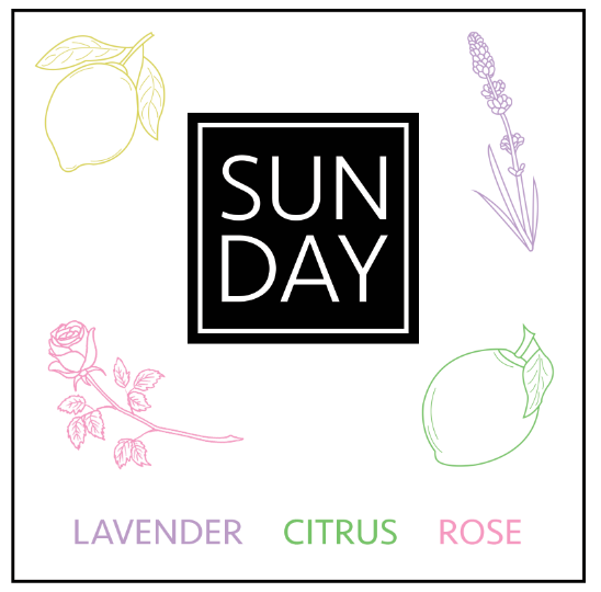
Initial scents:
1: Lavender, rose, citrus


Illustrations:


Mocked up to show front of box packaging:
2: Pine, ceder, mint, eucalyptus


Illustrations:


Mocked up to show front of box packaging:

However after looking at these designs we agreed that the design could progress further with looking at the third idea. The concept of including the shape of a flame flickering to produce a geometric pattern ensures that the packaging reflects the product.
Idea 3:


As a packaging piece myself and Natasha agreed that this was a much stronger design as the bold colour really represents the scents. I initially tried the design for the lavender scented candles, choosing a strong purple colour would make the packaging stand out on her stalls as her initial packaging was white with brown papers. However to develop this further Natasha suggested using black within the pattern to give the design depth and allow the purple to stand out.
I then put this design across the initial two and a new scent:

To finalise this design I put a board together which would pitch the branding and packaging idea together across a few different mock ups. This includes:
Packaging for boxes and stickers for candle jars.
The print to be used across packaging and bags.
How the website could look.
No comments:
Post a Comment